












Bizum Help
A platform that connects people with a positive look at what can be done to change the world
Background
Bizum Help is a secondary Bizum brand. It’s a visibility and communication tool aimed at connecting people who want to donate to causes and charities in need. Bizum Help was created to make it easy for the donors’ money to reach those who need it most.
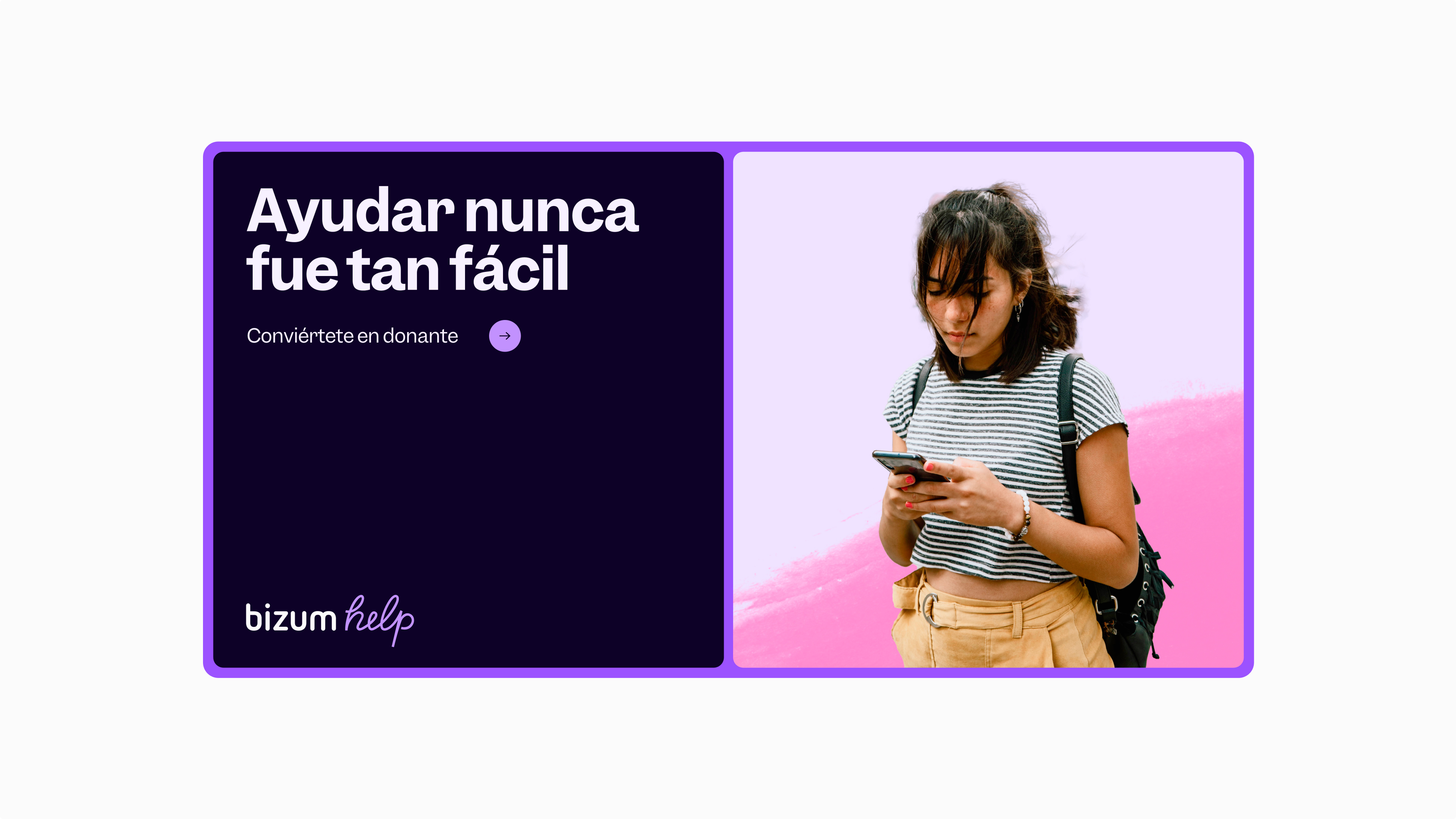
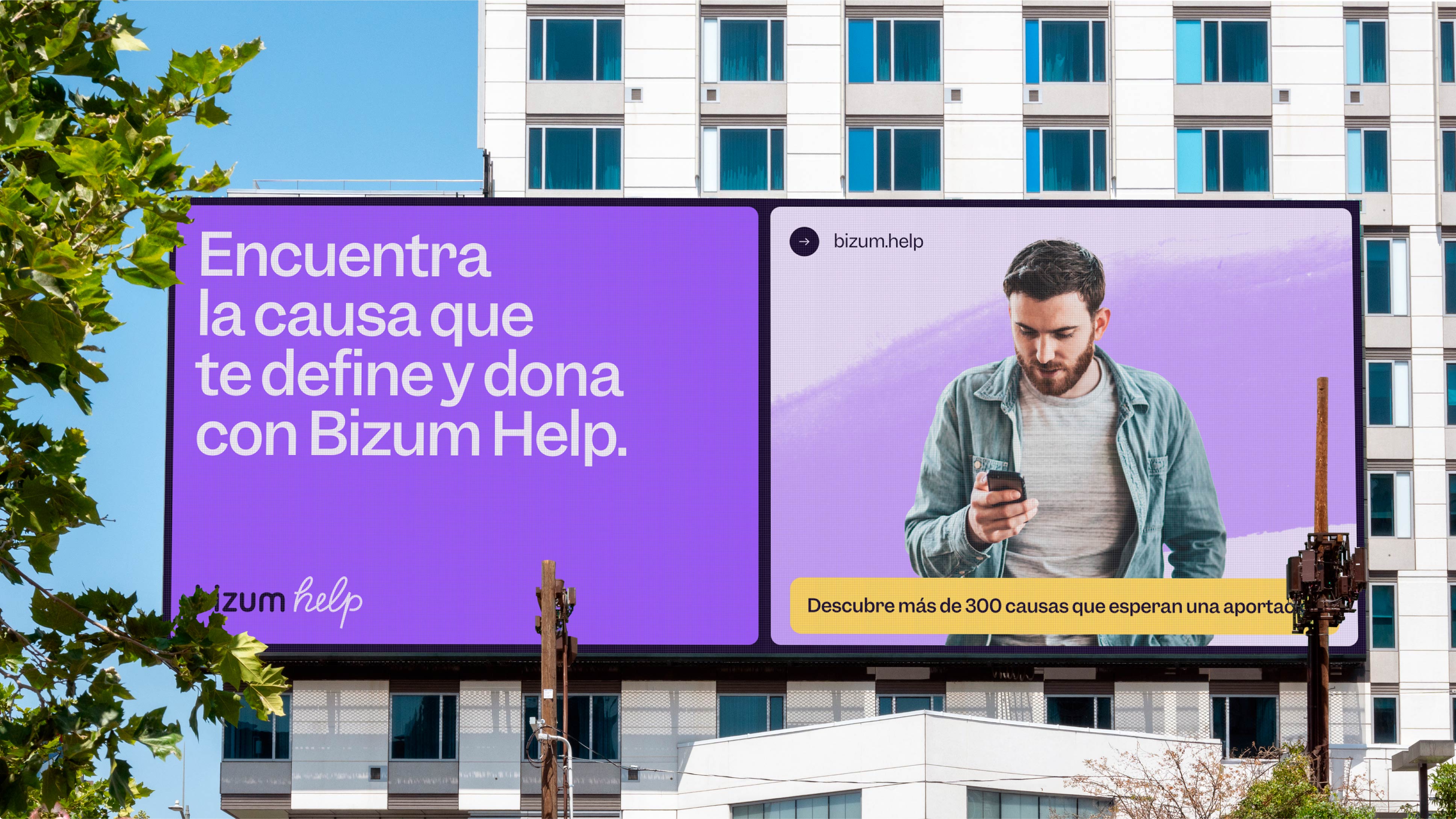
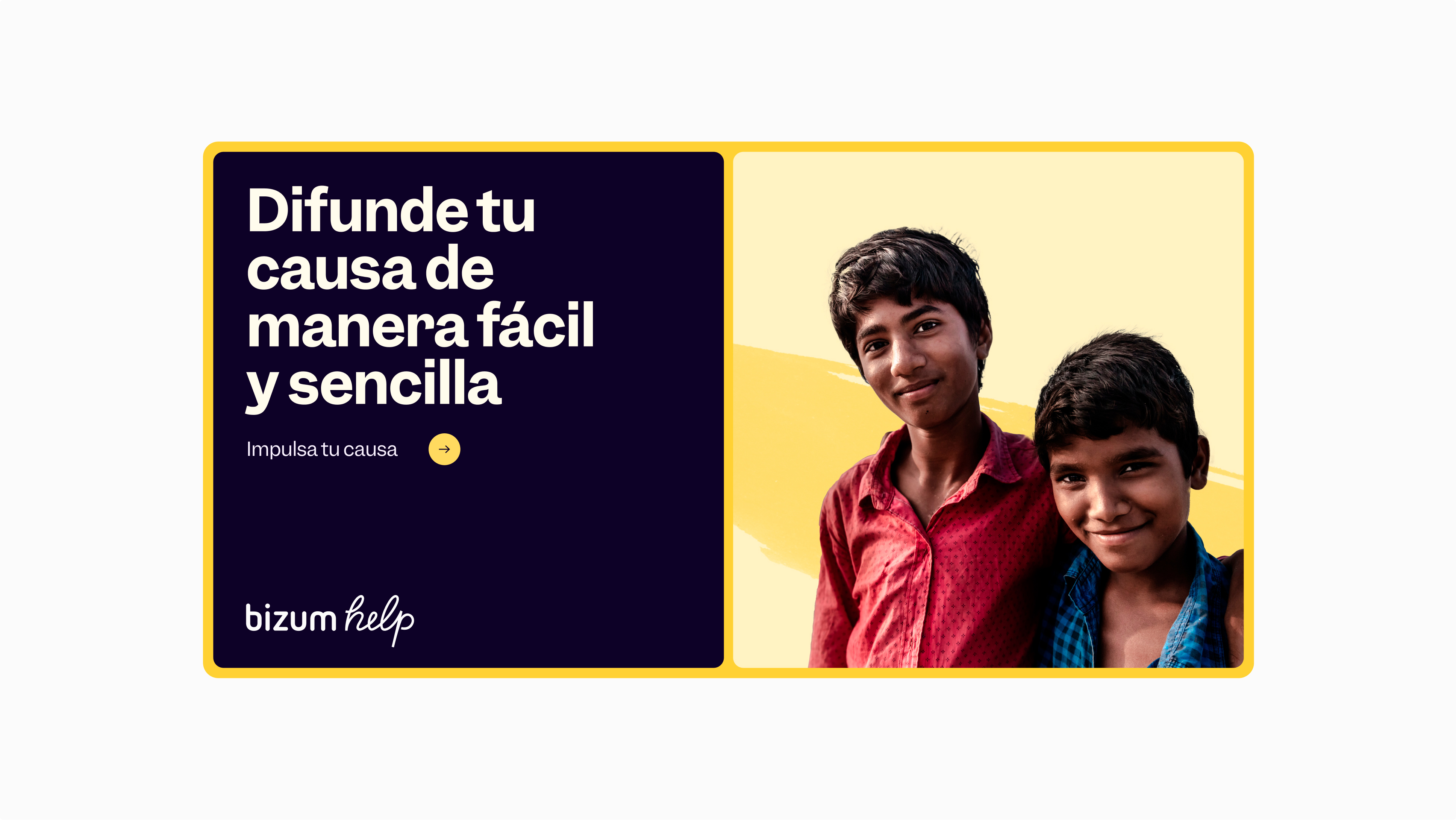
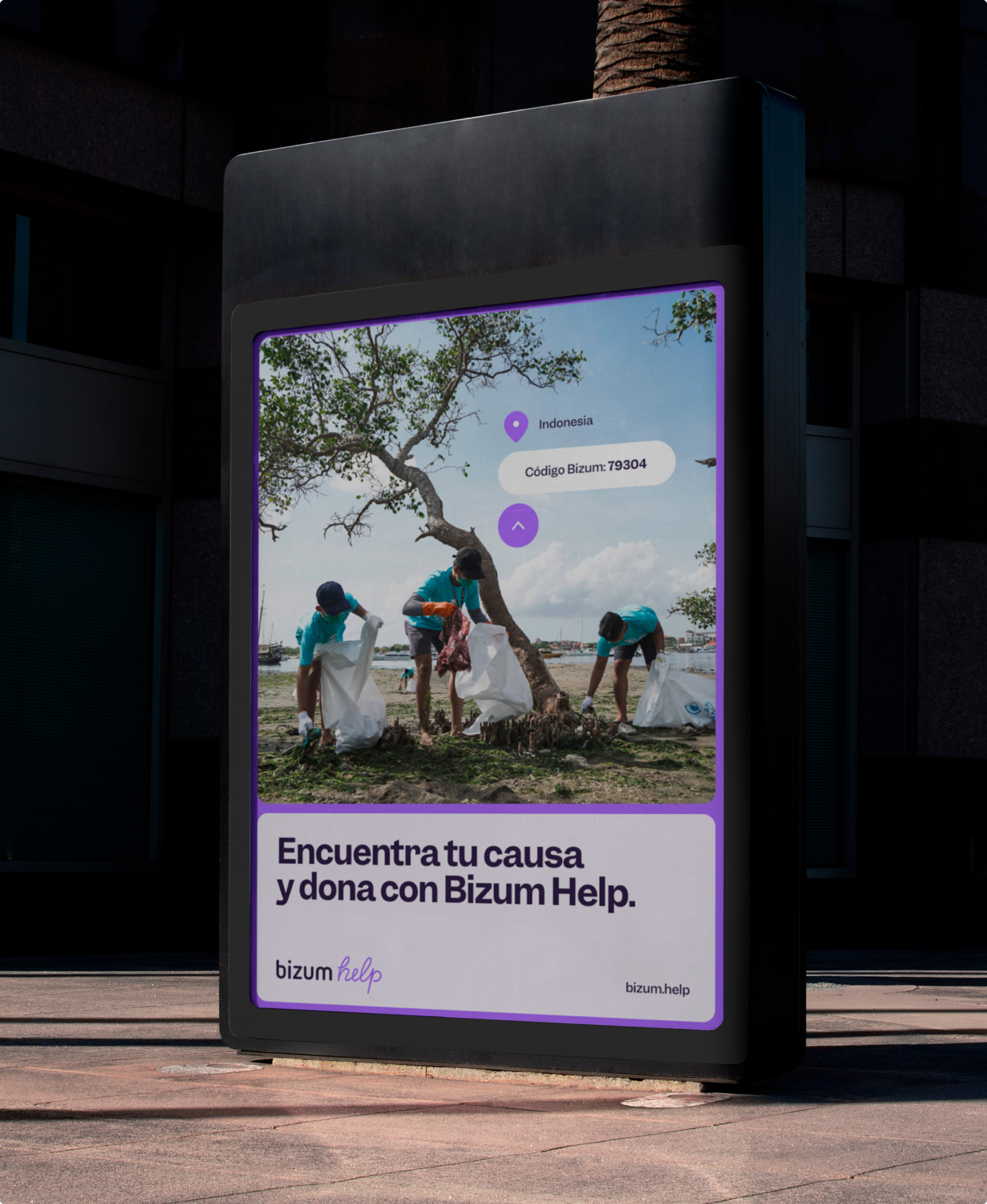
Bizum came to us with the need to communicate the brand and its use positively and clearly. We present a fresh identity, with a lively color palette and constructive messages.



Brand expression
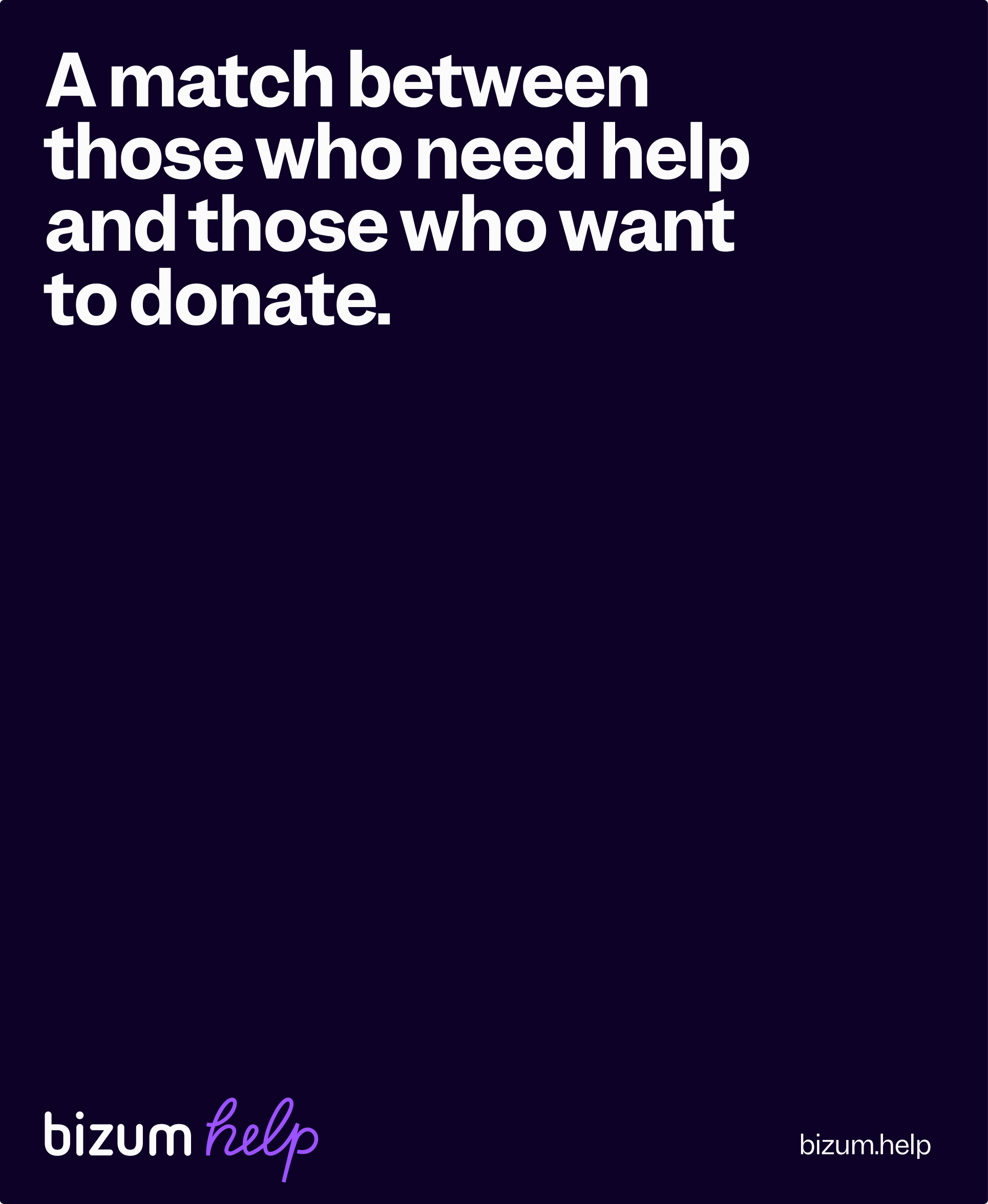
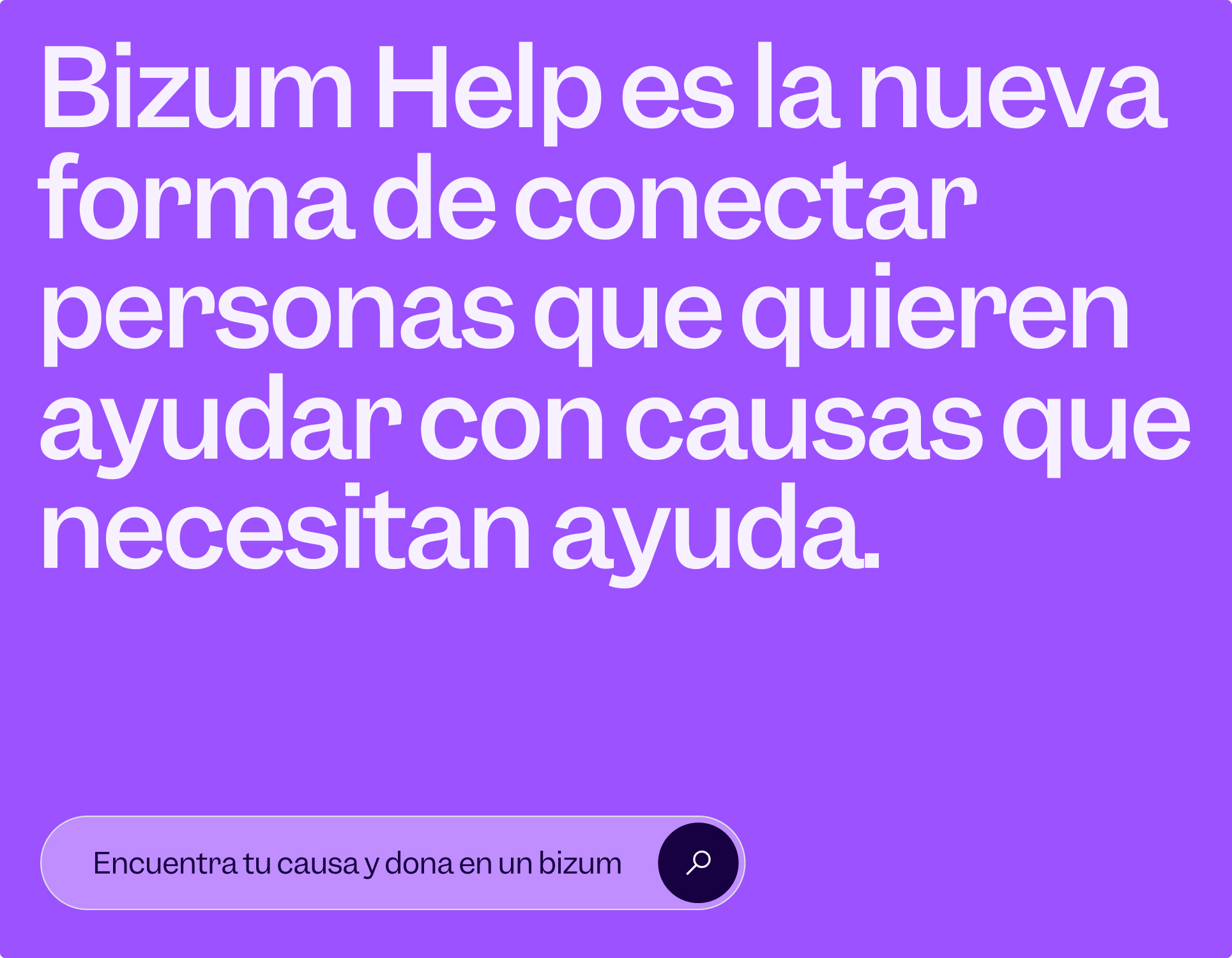
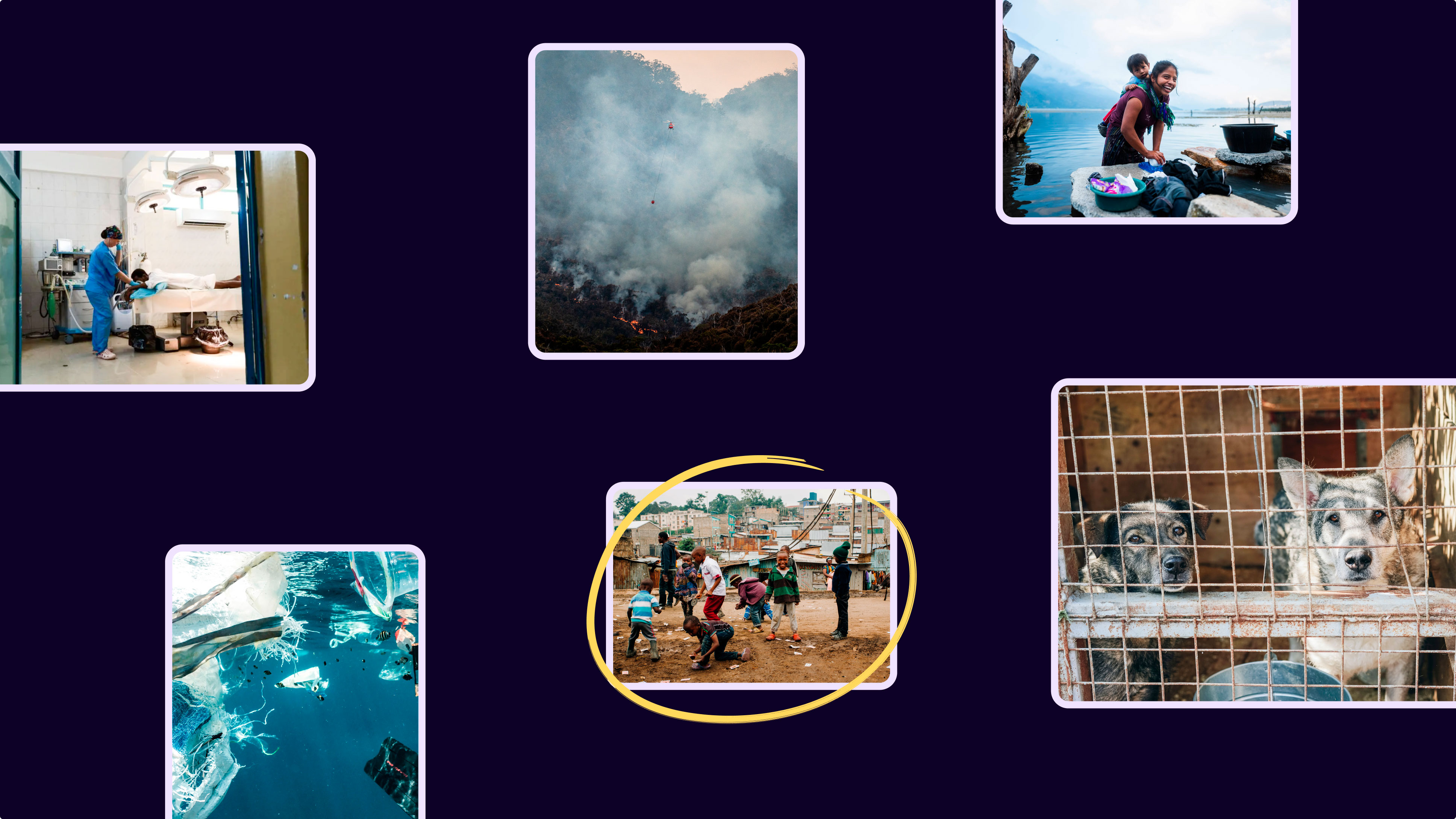
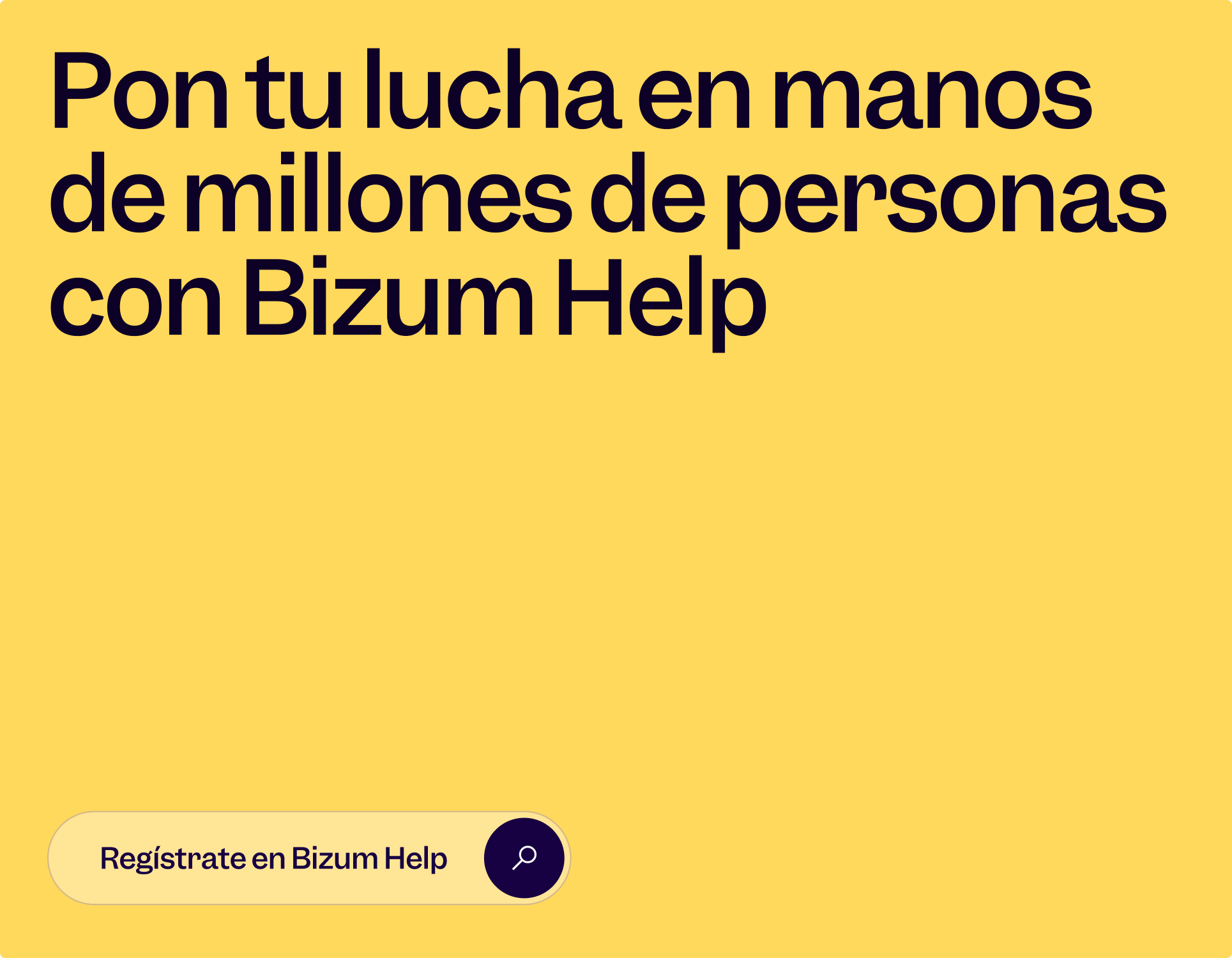
Putting the main use in the centre of communication, our concept evolved from the concept of searching and finding, creating a special match to connect people with causes.
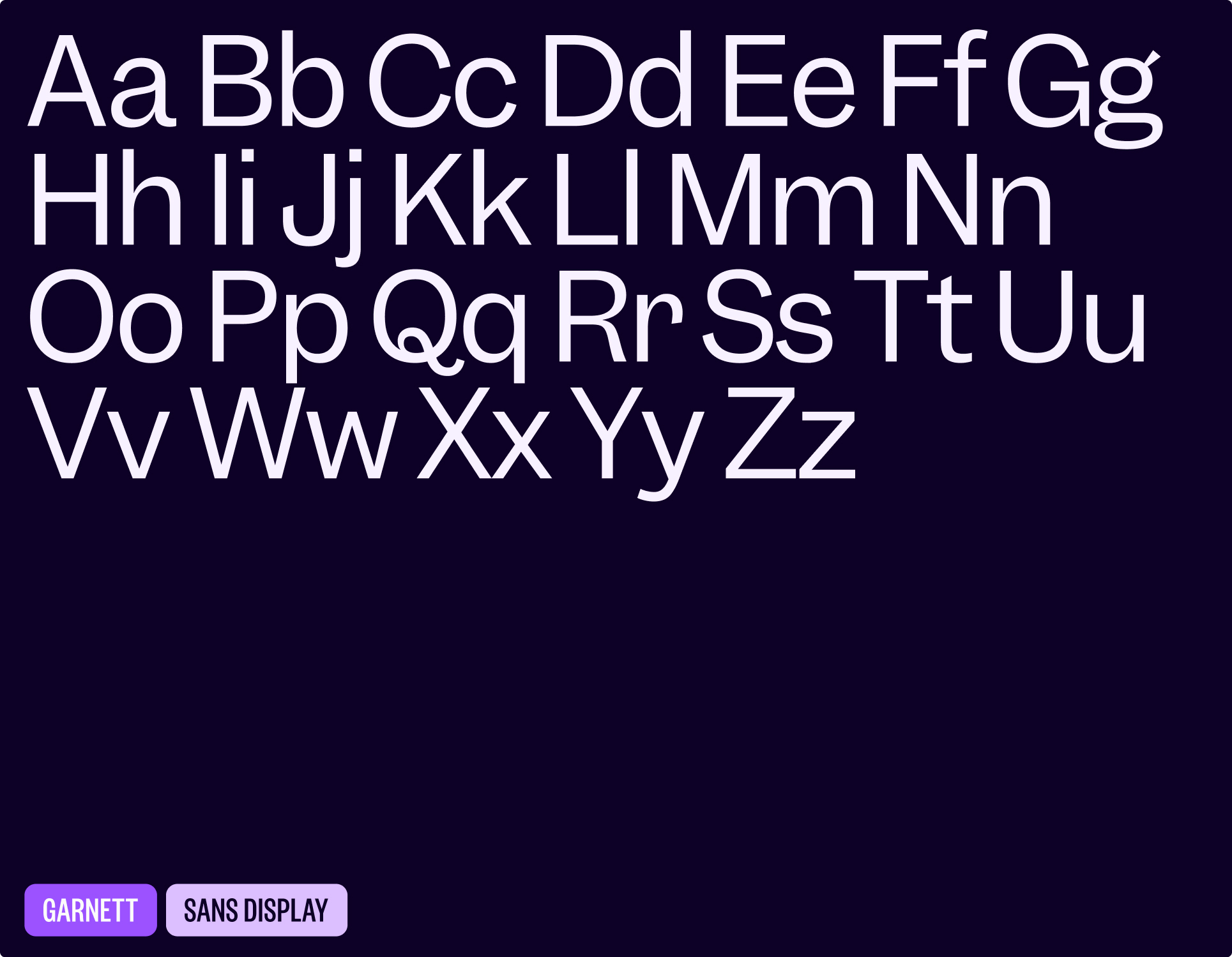
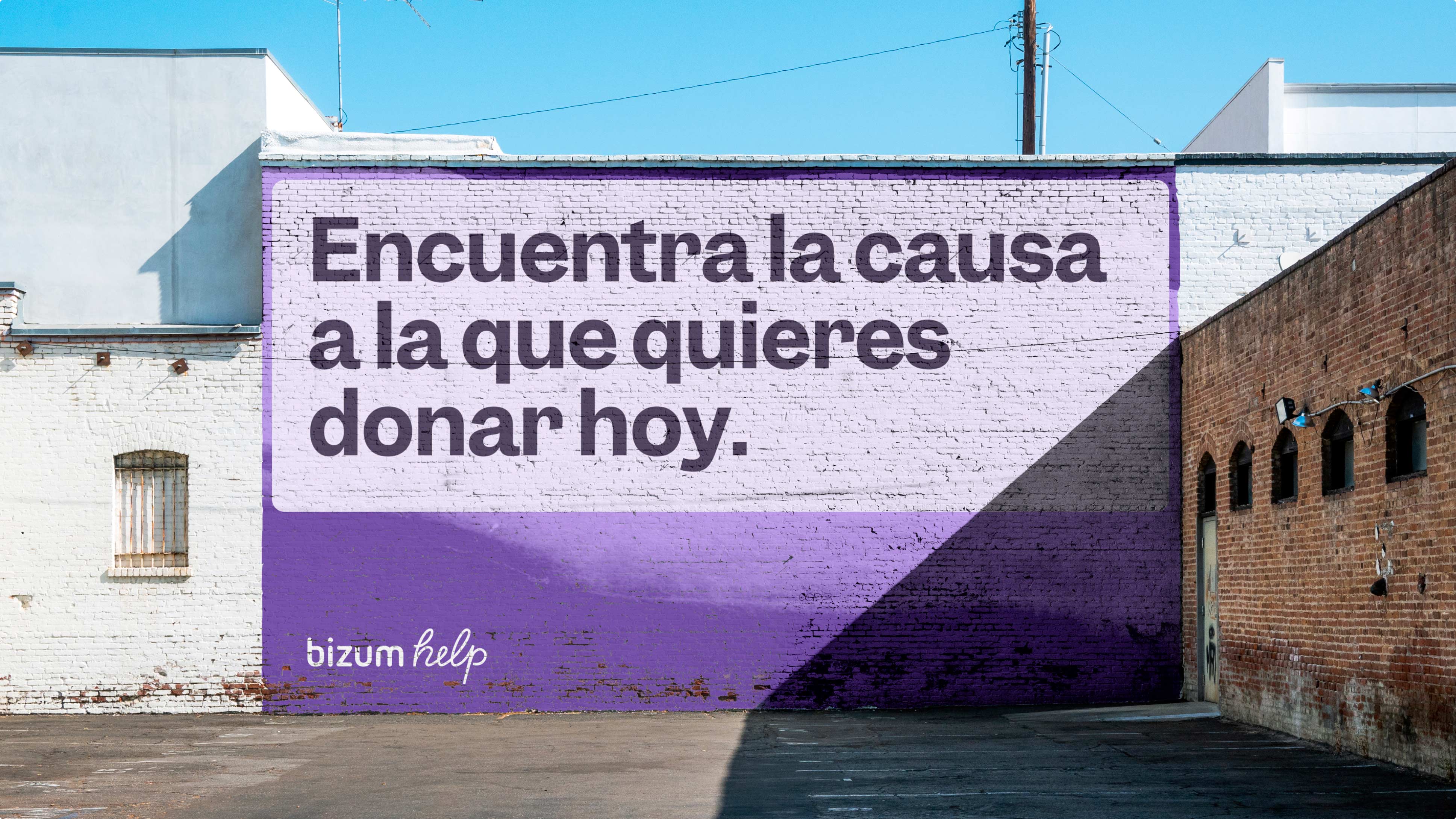
The choice of colour is part of the vibrant secondary palette from Bizum, emphasizing the importance of diversity with purple and yellow as energetic colours and also used on the website to differentiate donor and organization sections.



Brand Implementation
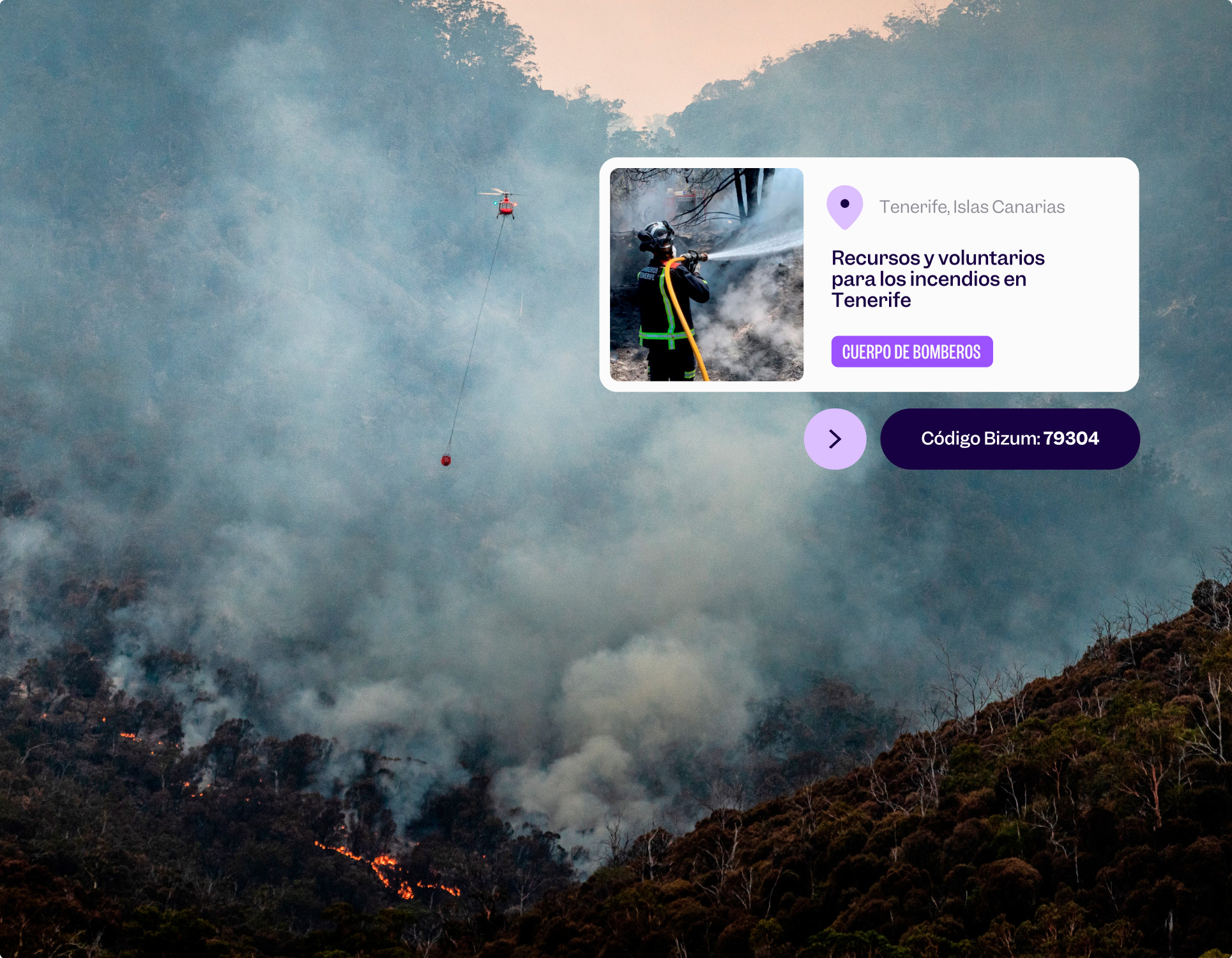
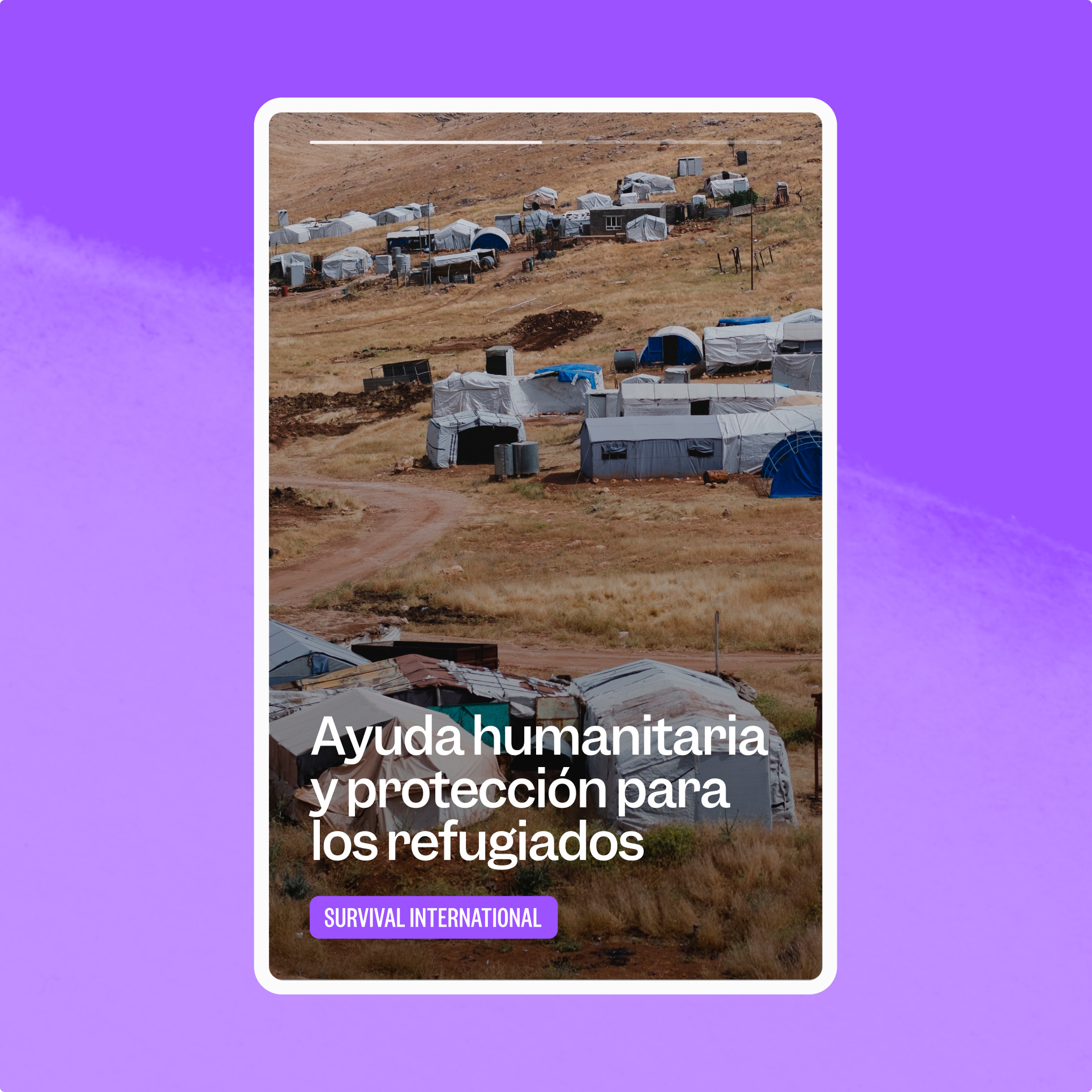
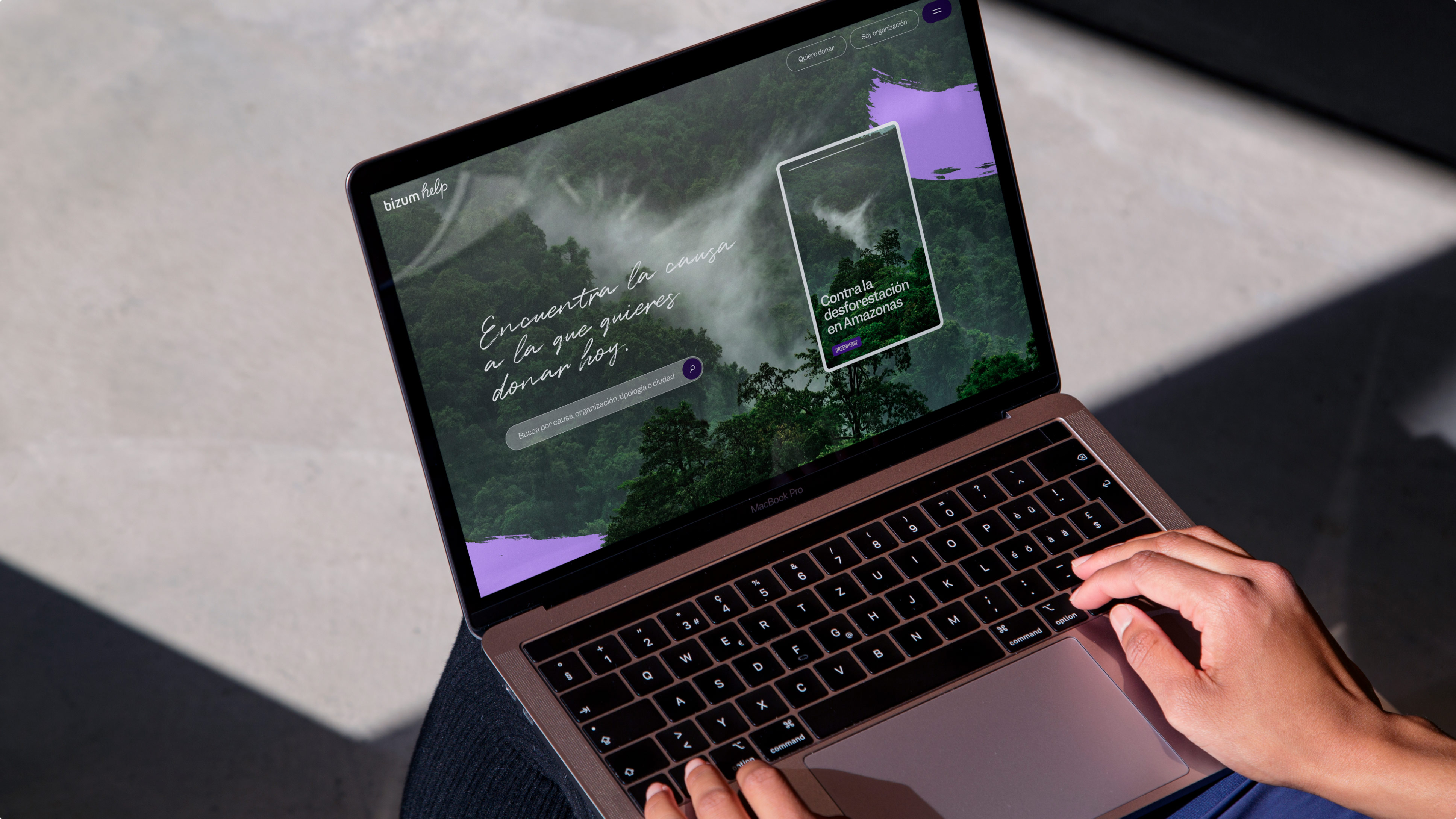
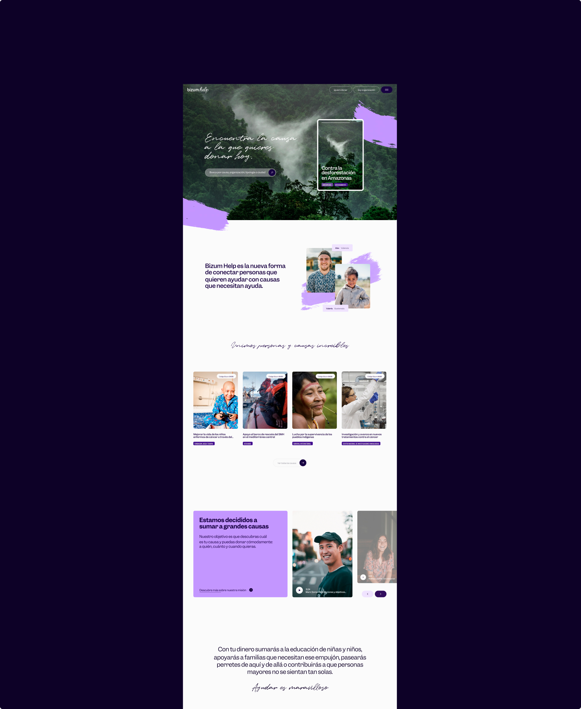
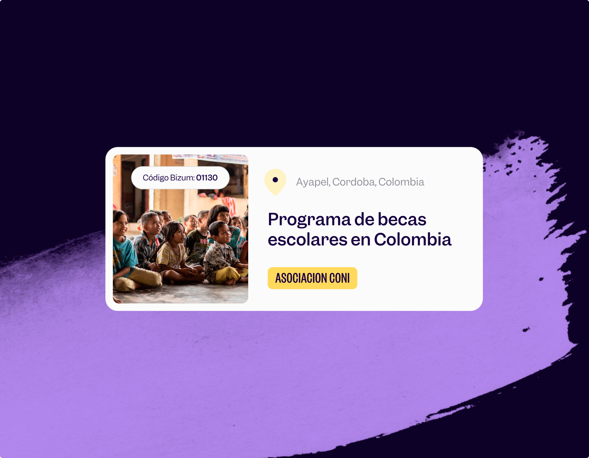
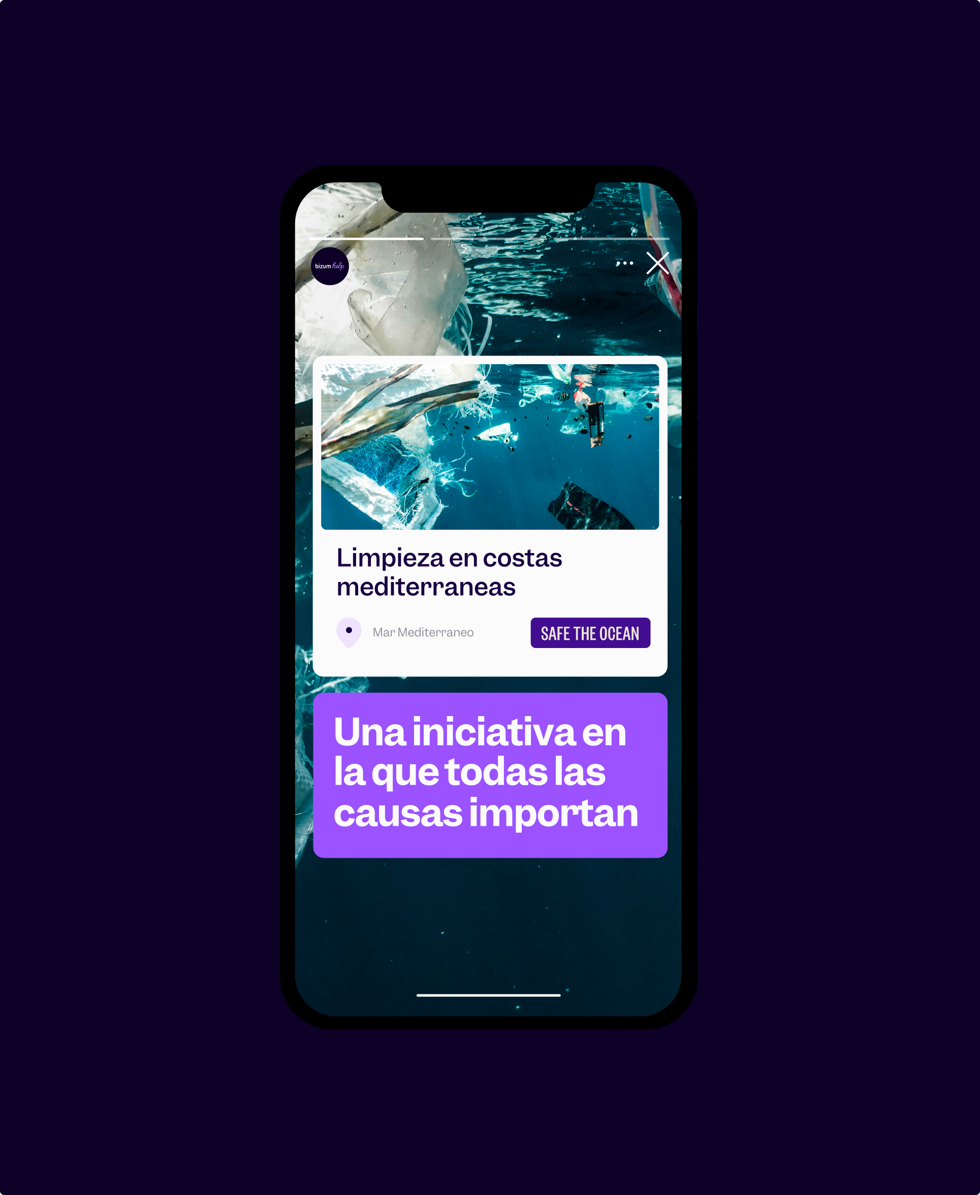
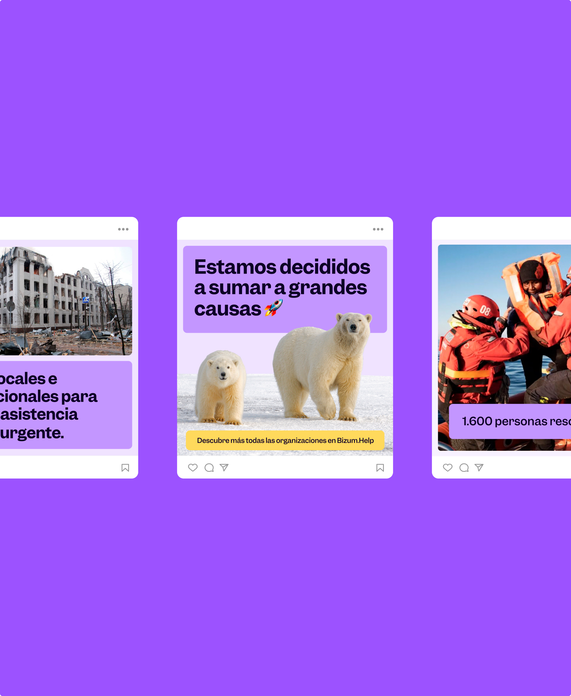
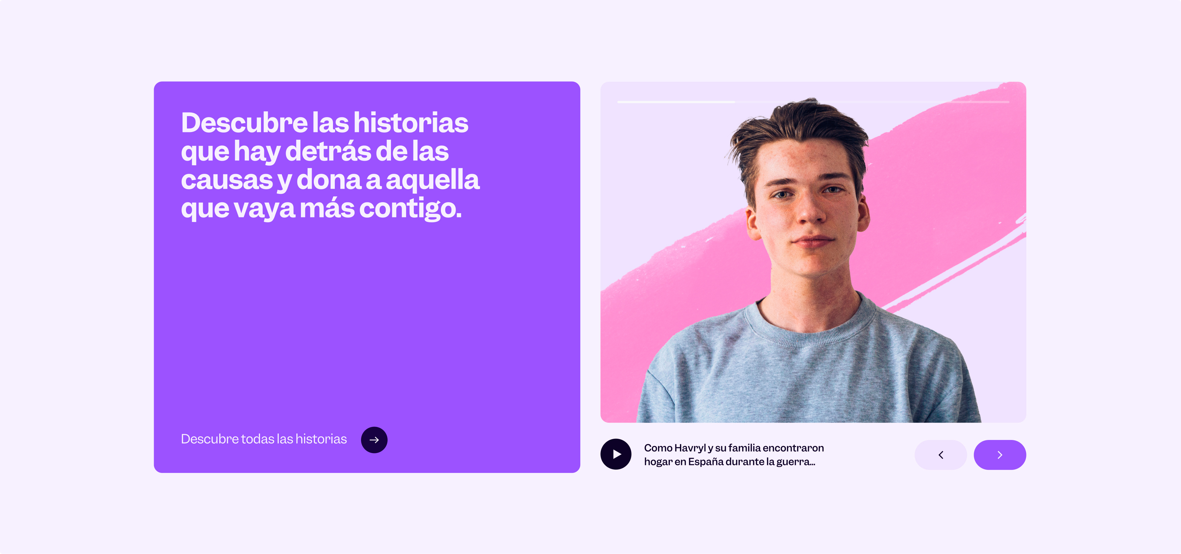
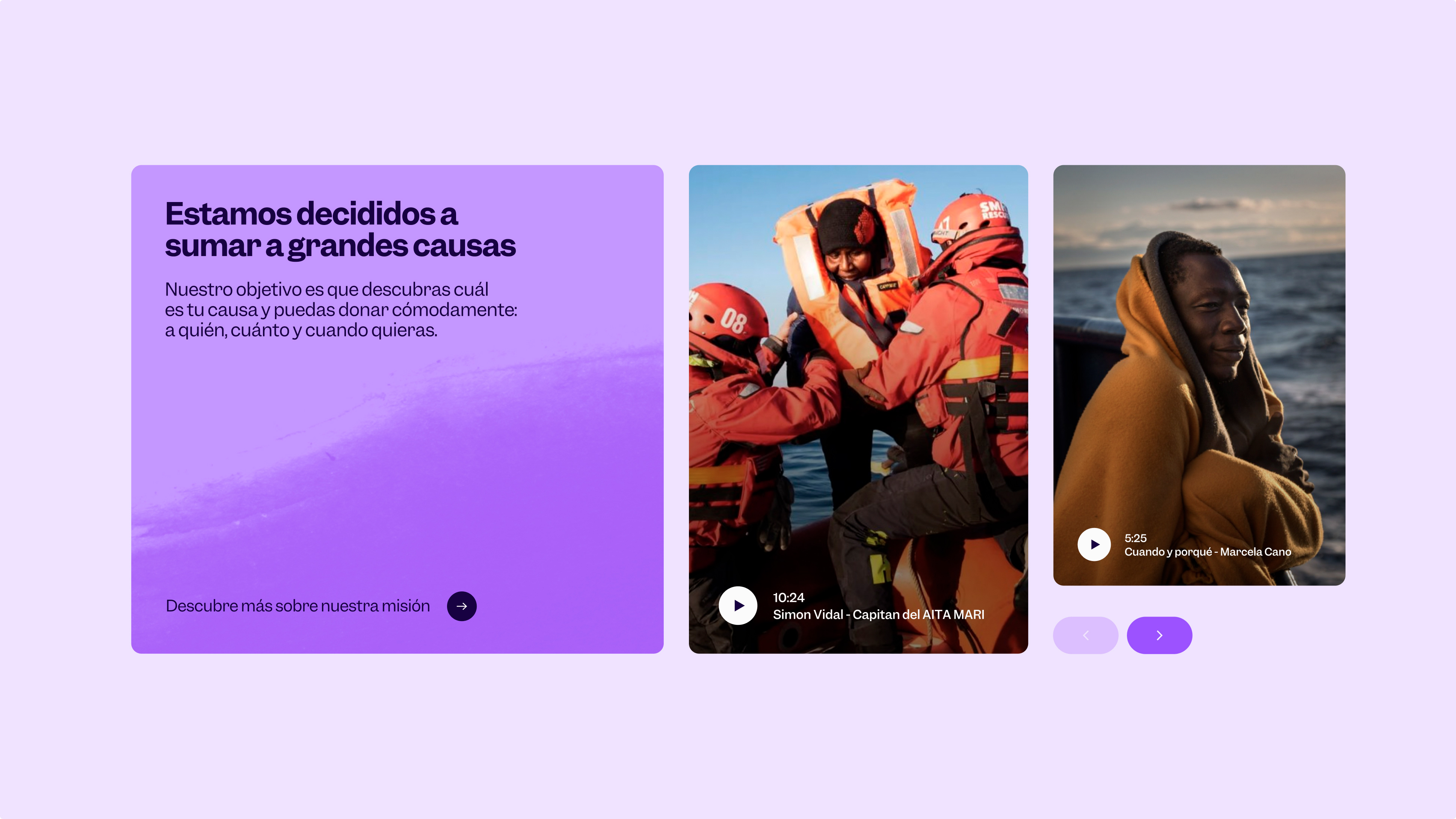
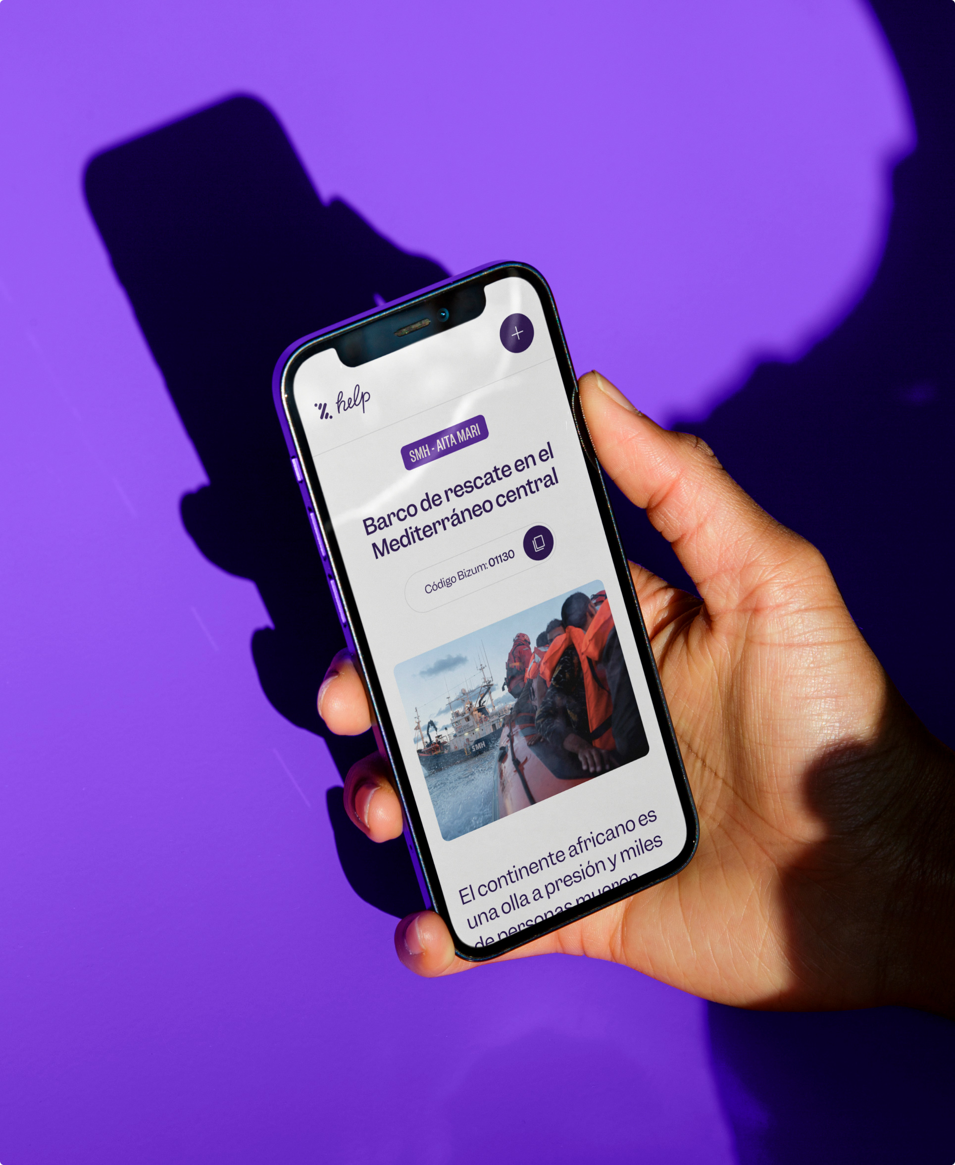
Being the website the main communication platform, in which all causes are represented in the same format, all the information had to be exposed and designed so that the donor receives the information intuitively.

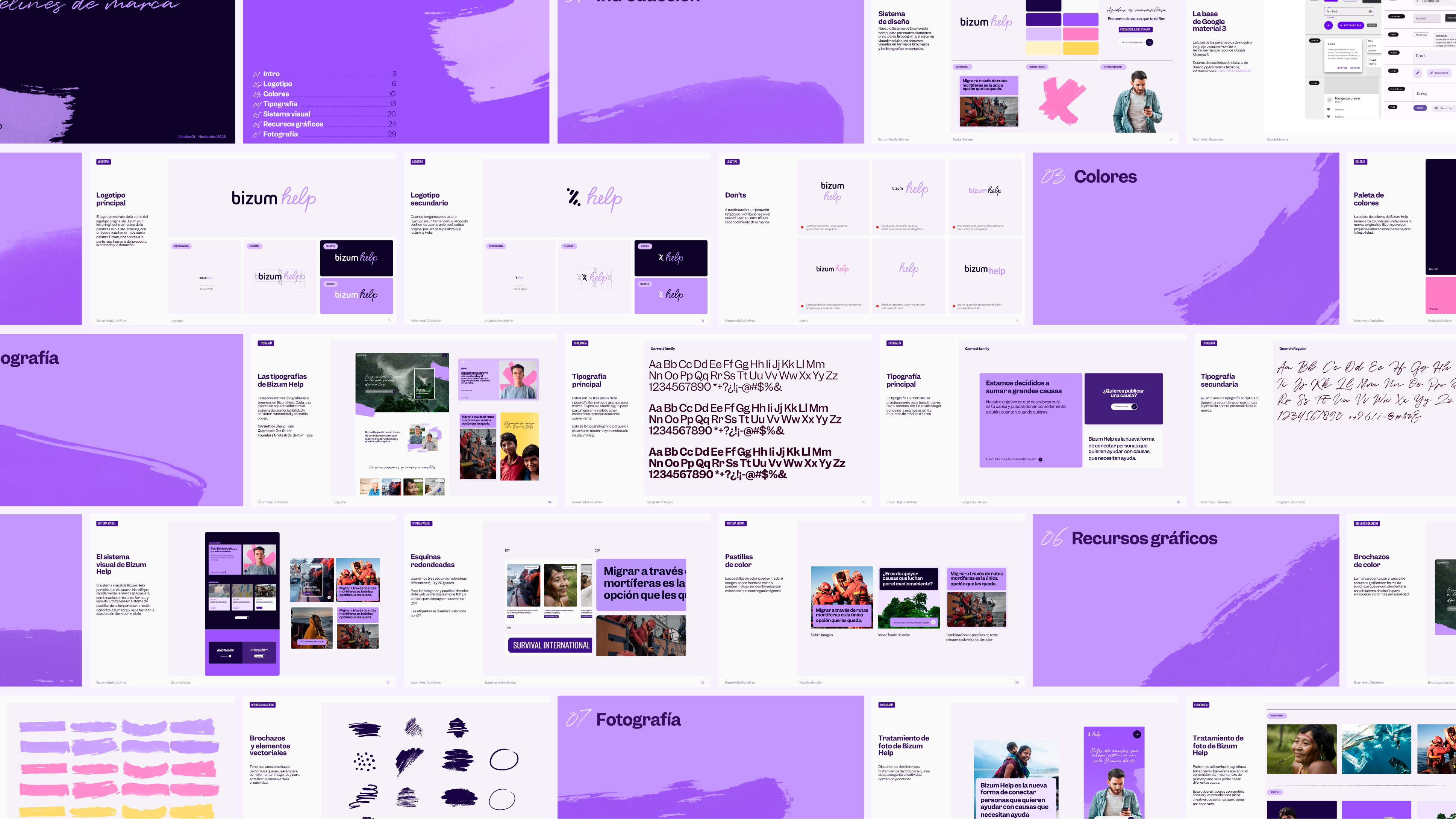
Brand Guidelines
To make sure the brand is implemented correctly, we developed an instruction manual and rule book laying out all the visual details, as well as important notes about the company’s voice, tone, and messaging.