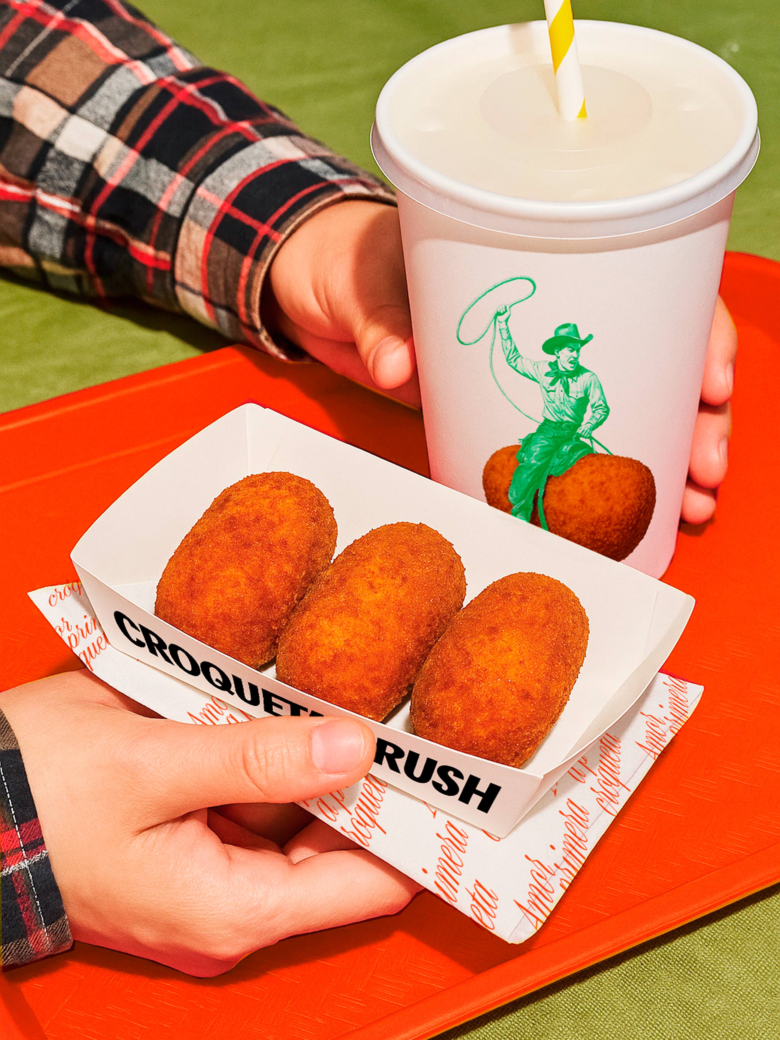




We started from a metaphor as powerful as it is everyday: falling in love with a croquette. Like an unexpected match on a dating app. A spark. A crush. With this approach, we decided to create a brand that blends flirting, humor, and food culture in a playful, irreverent, and direct tone.
One that connects with a young, foodie audience without falling into clichés or losing authenticity.
Work
Croqueta Crush
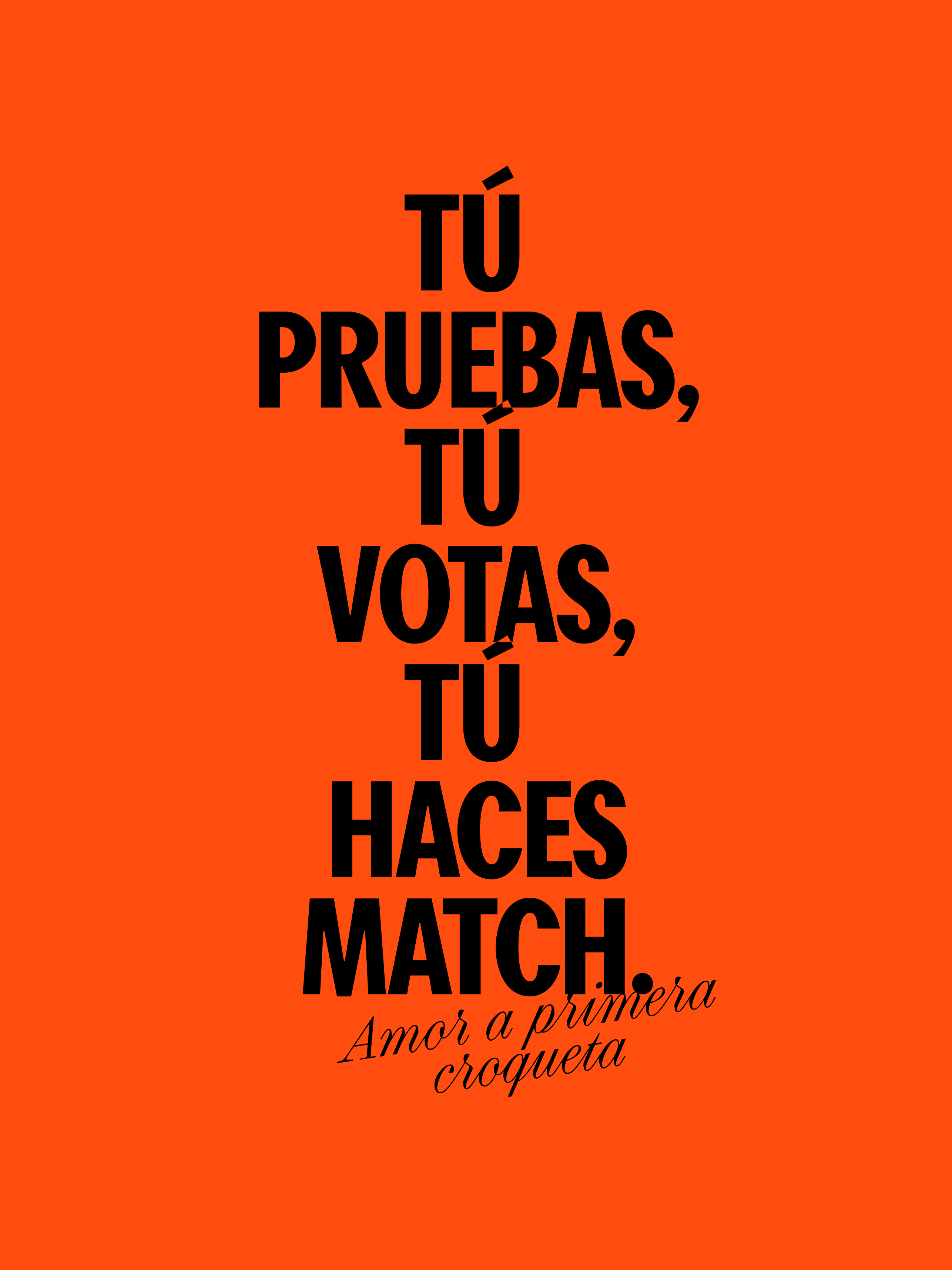
Amor a primera vista. You taste. You vote. You make a match.
Background
Croqueta Crush is a traveling food festival that celebrates one of the most beloved bites of our culture: the croquette. Pleisure approached us to create a brand with soul, hungry to win the hearts (and stomachs) of the audience. And thus, Croqueta Crush was born: a festival of croquette personalities, where you taste, vote, and decide who deserves your love.
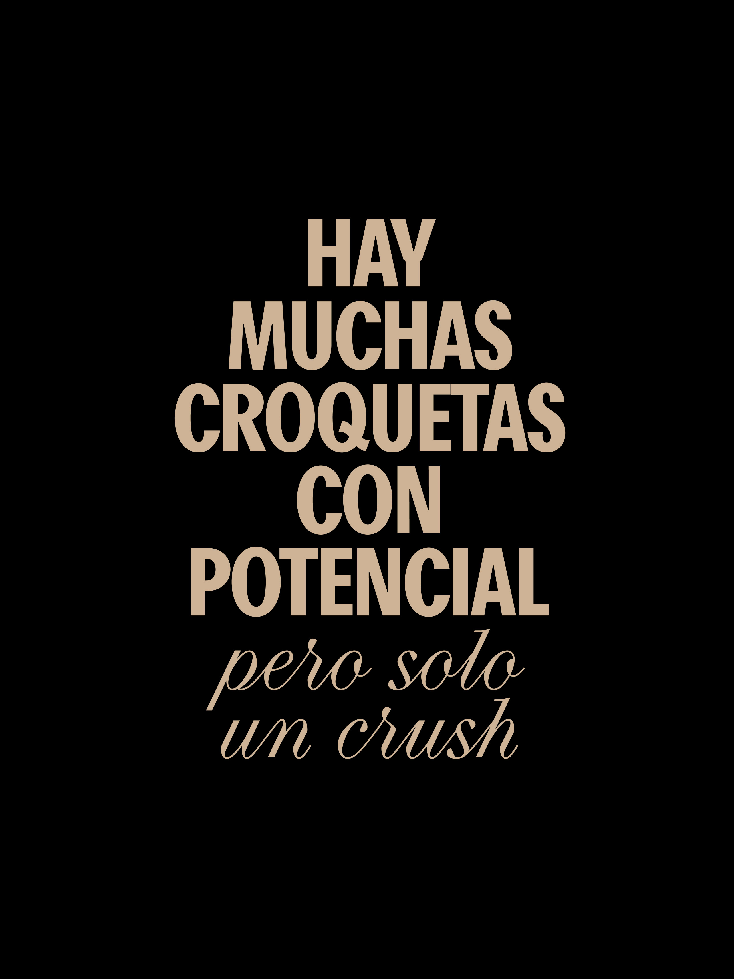
Concept
Verbal expression
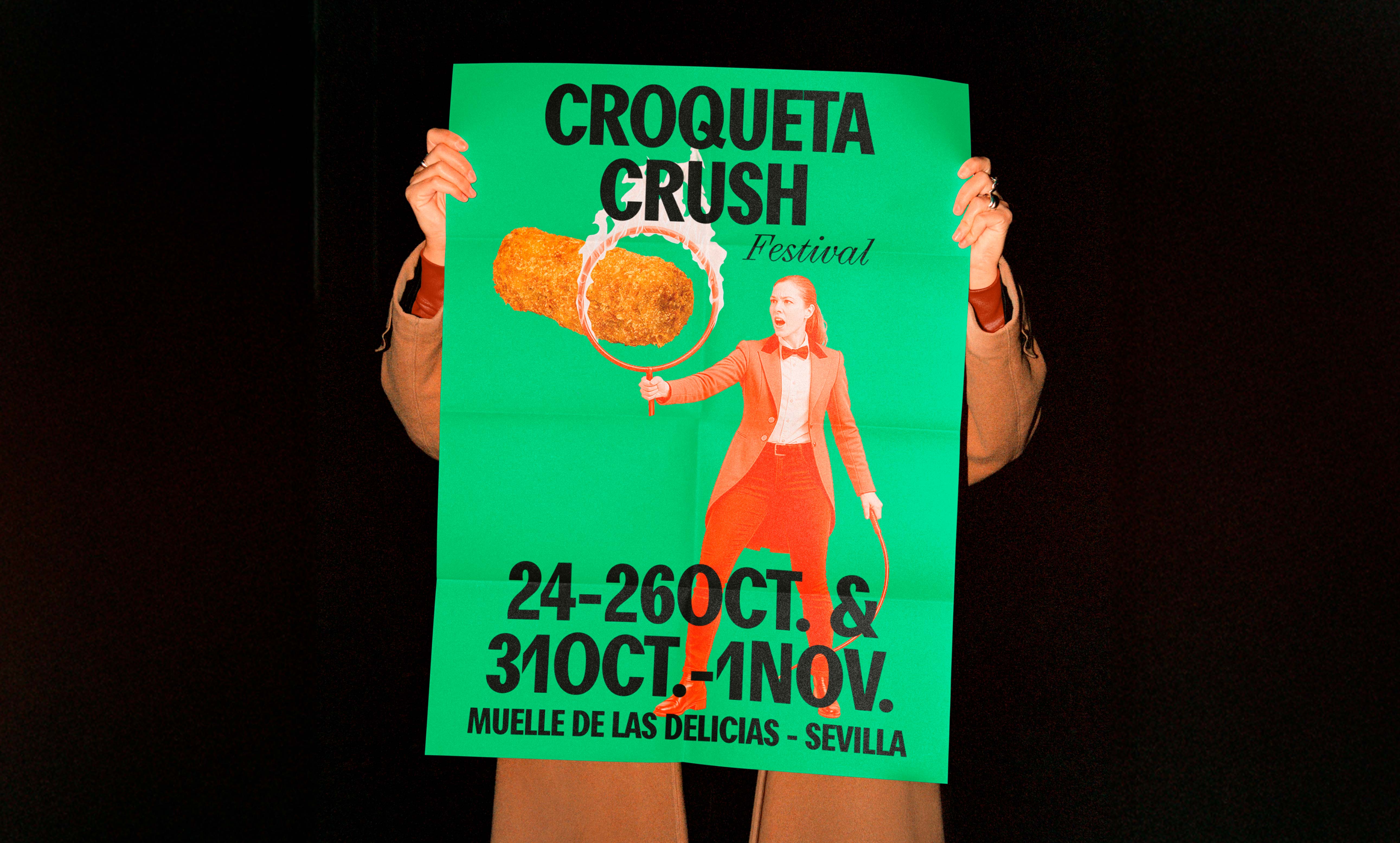
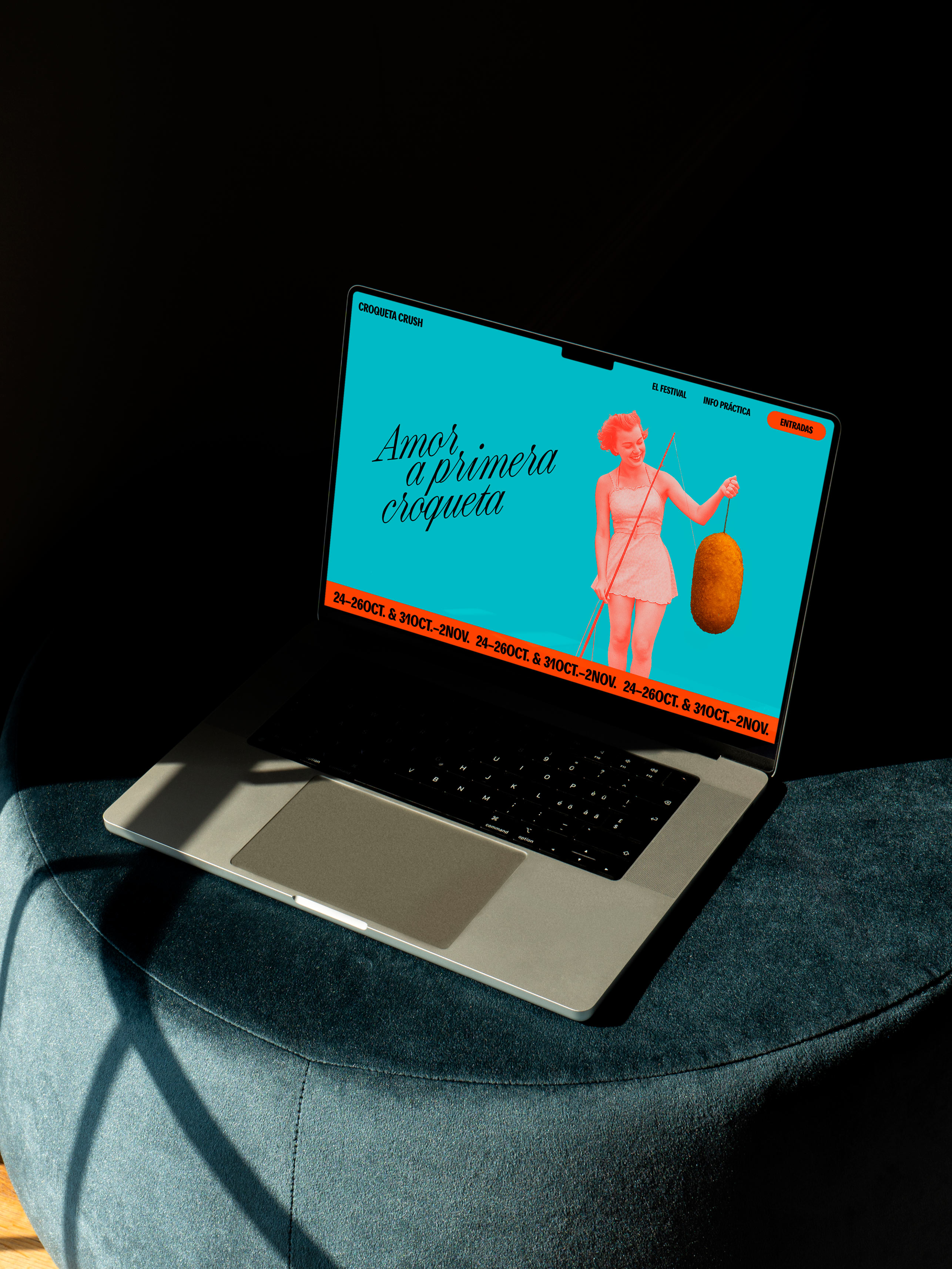
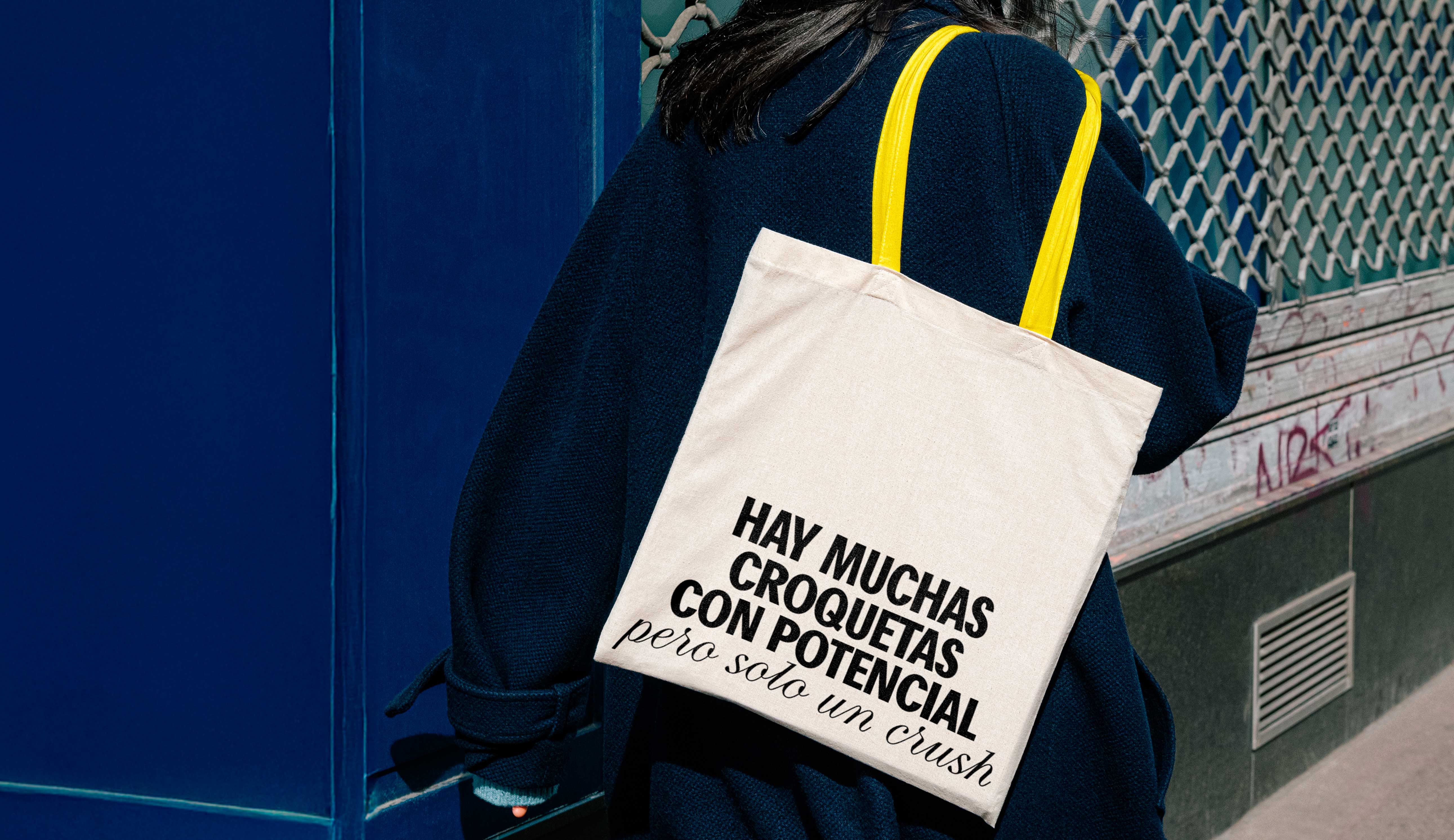
We created a name that says it all: Croqueta Crush. Direct, memorable, and with a double meaning. Then we defined a verbal identity that combines humor, desire, discovery, and surprise. A bold, friendly, and unapologetic tone that allows us to build a narrative where each croquette has its own personality, vibe, and attitude—just like the festival attendees.
Visual expression
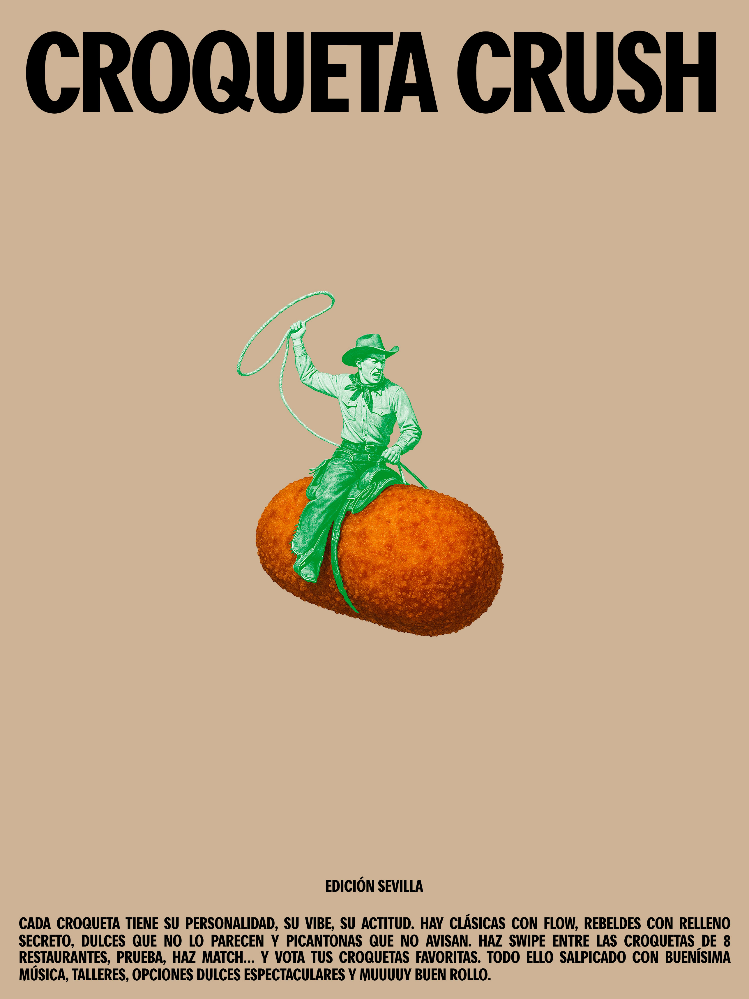
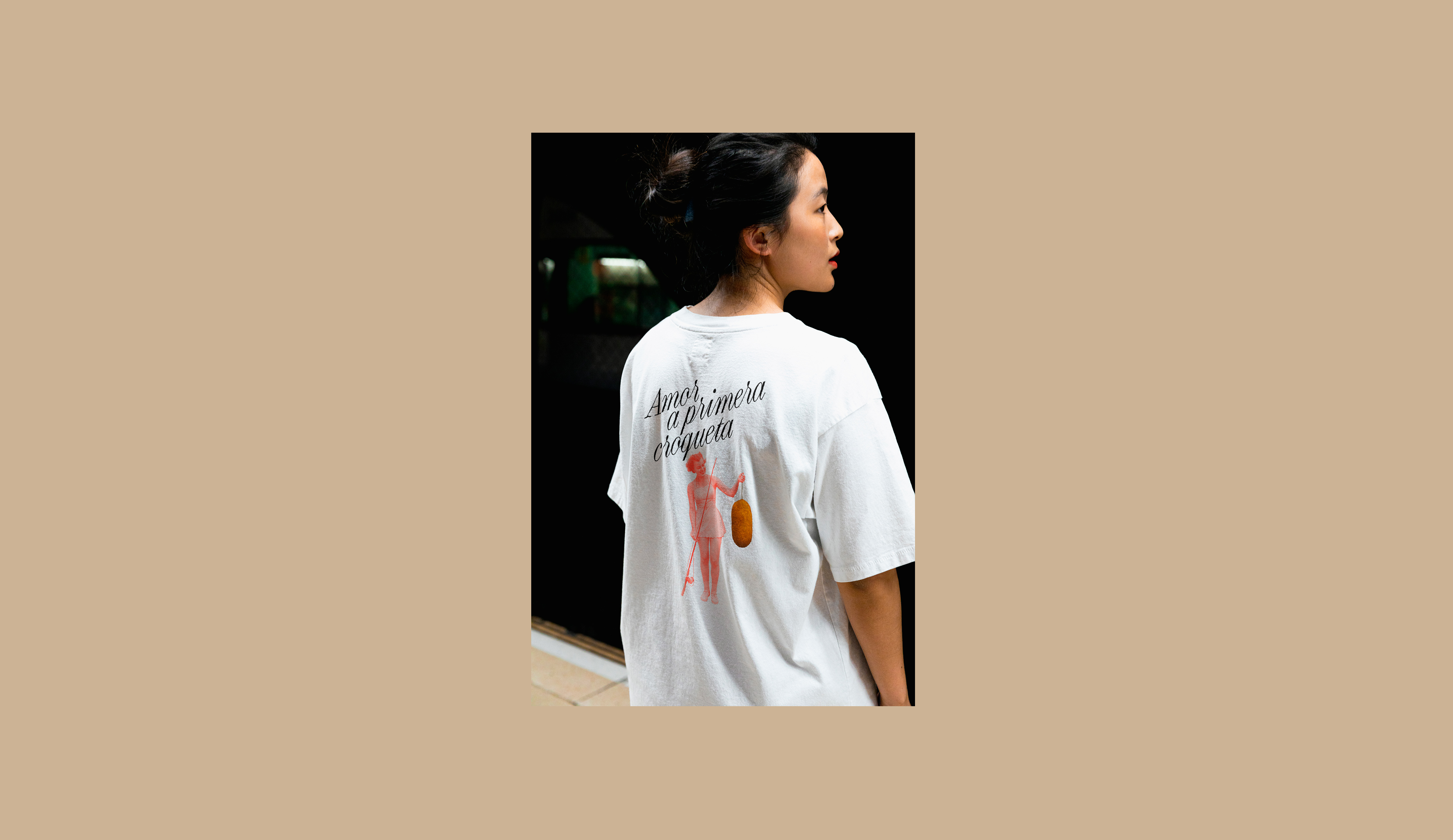
The illustrations are the heart of the graphic system: digital collages that literally show people interacting romantically with croquettes. Gazes, caresses, dances… each micro-scene represents a unique and exaggerated crush, with an aesthetic somewhere between vintage and absurd, making the brand irresistible content both on social media and in physical spaces.
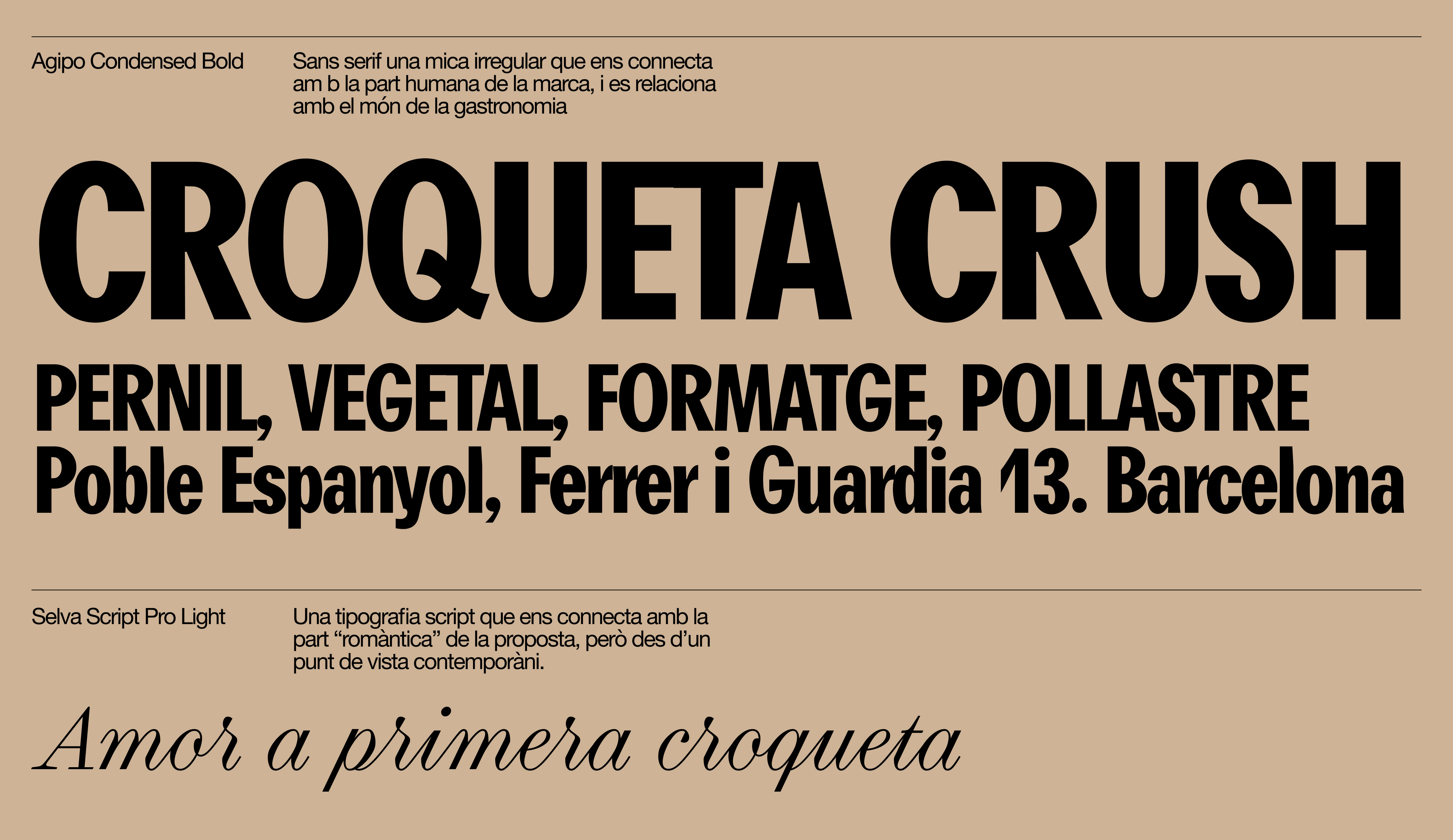
Typographically, we combined a humanist sans serif with a contemporary script that reinforces the emotional and playful tone of the concept. Visually, a bright, bold, and fun color palette enhances the festival’s carefree vibe and ensures a recognizable and fresh presence wherever it appears.