




Poble Espanyol
A new voice for a very versatile historical facility where history meets culture and leisure
Background
With 100 years, the Poble Espanyol, a venue with historical and architectural interest that attracts the attention of tourists and experts in architecture, will arrive because I would like to highlight the value of the venue and expand the range of cultural events and events oci, to be more attractive to a global public and to increase its link with the city of Barcelona, its citizens and its cultural heritage. Apart from fer canvis in the Poble offer, it is going to decide to create a completely new brand.
The arch
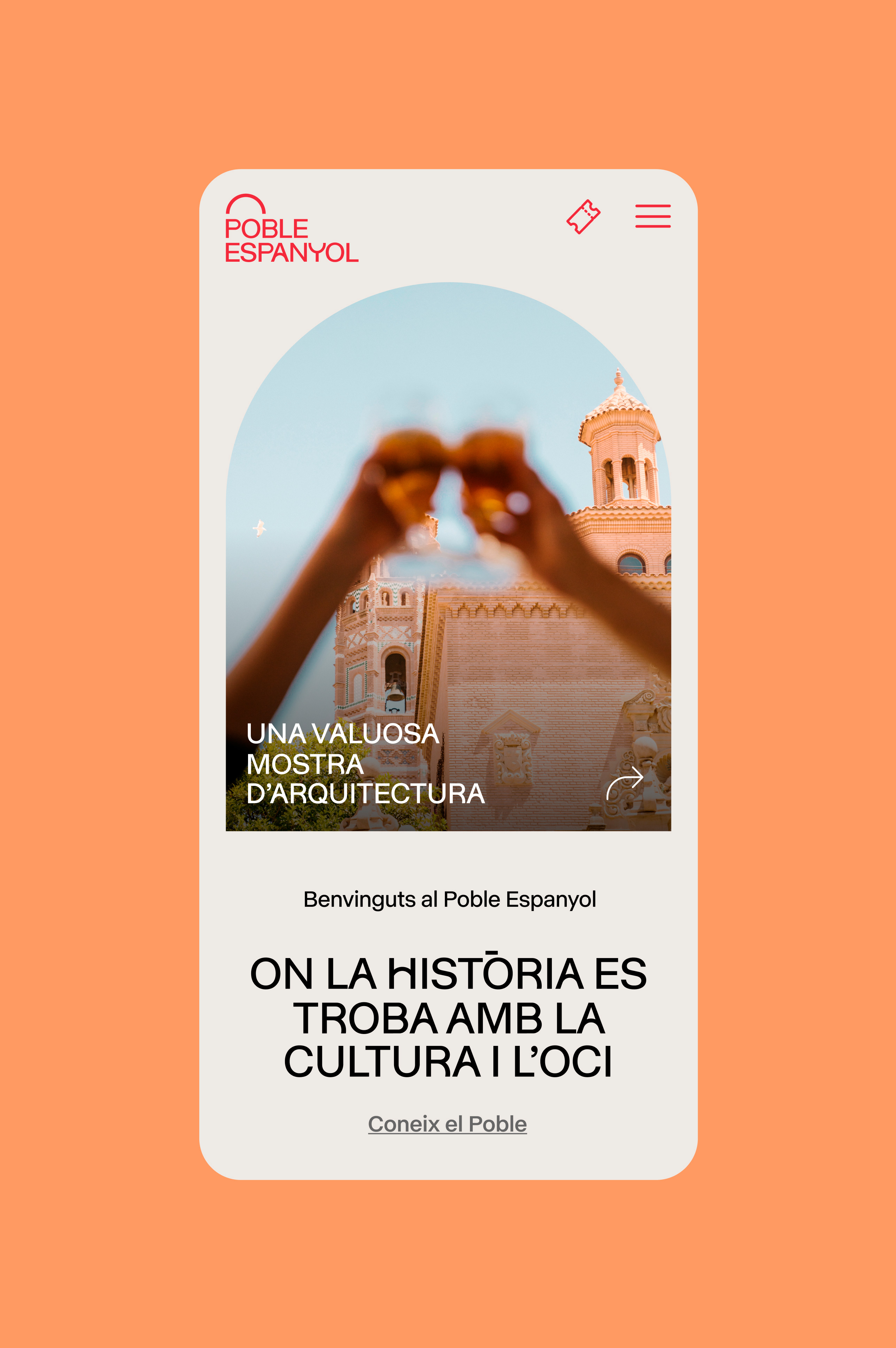
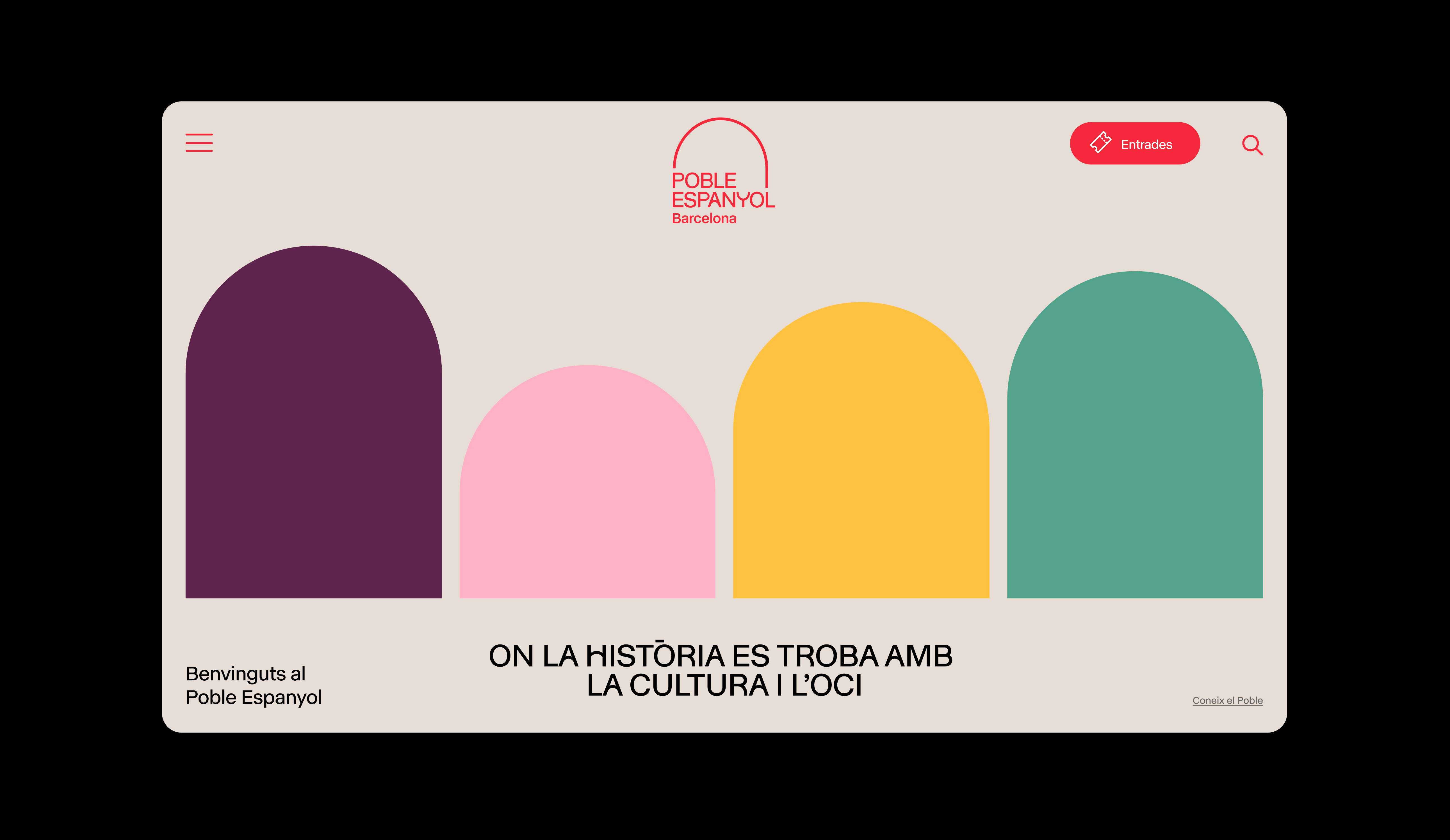
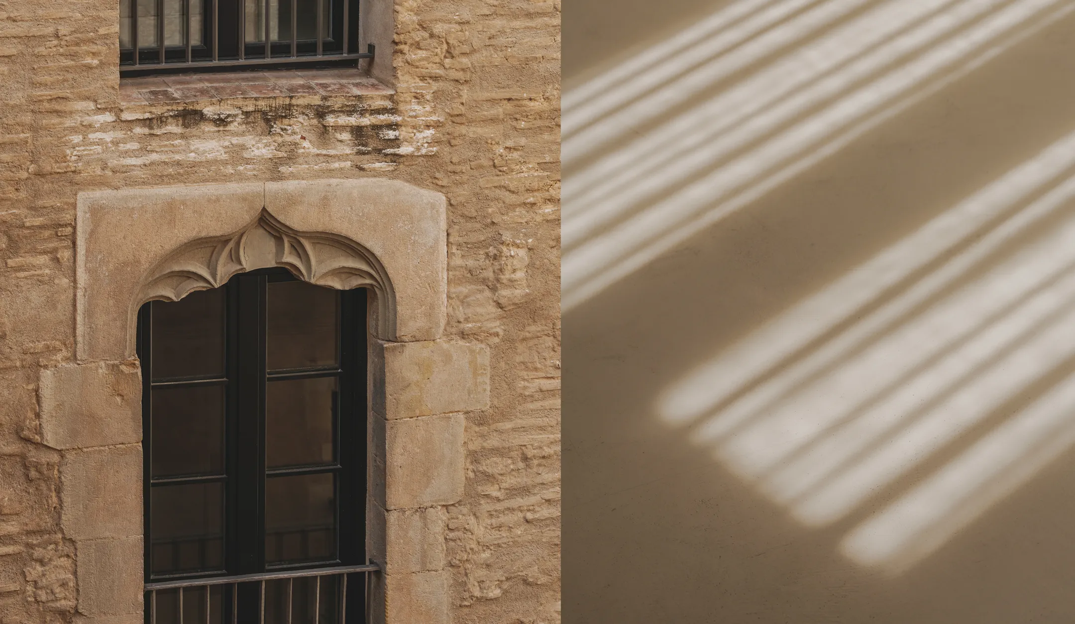
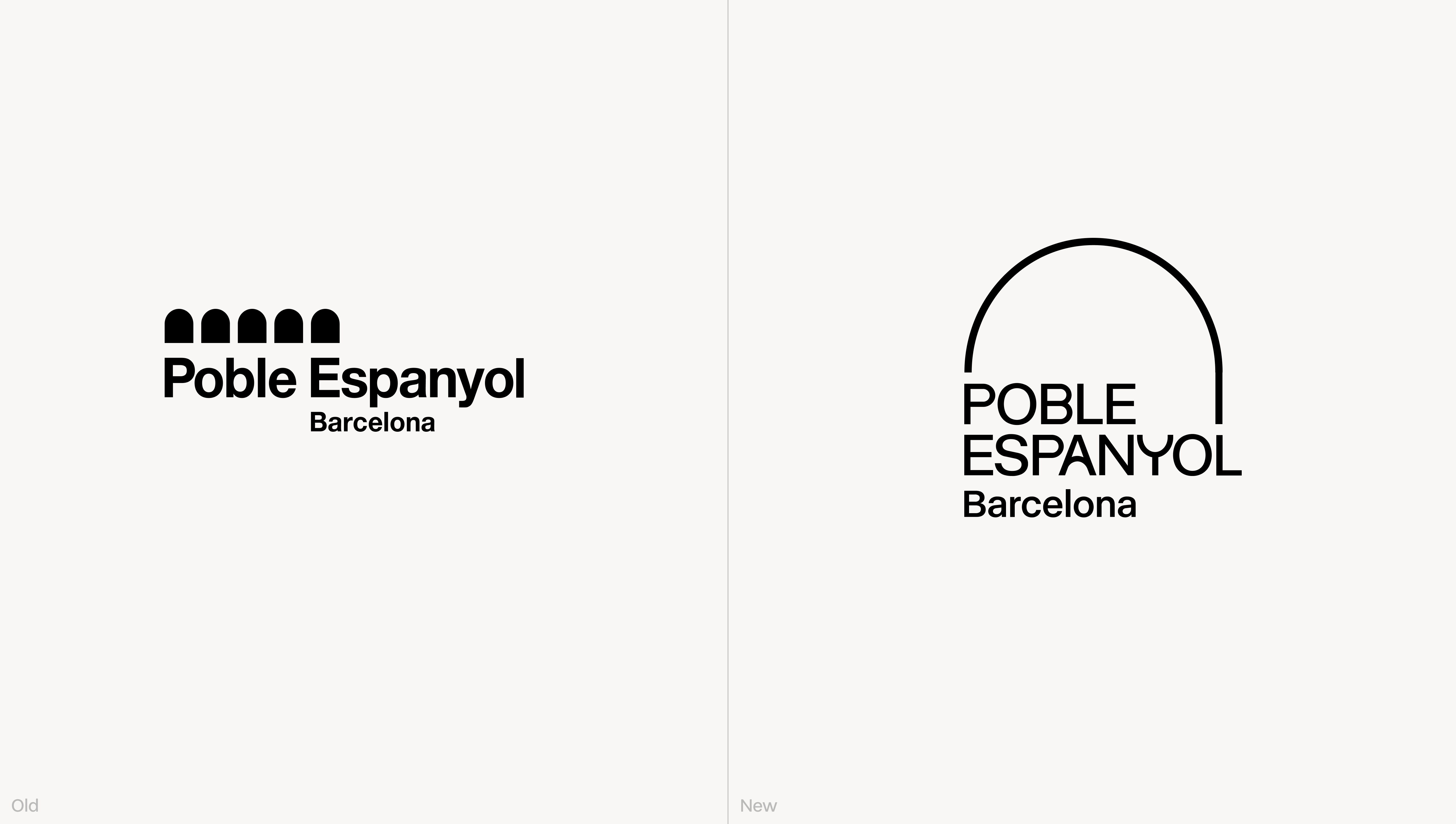
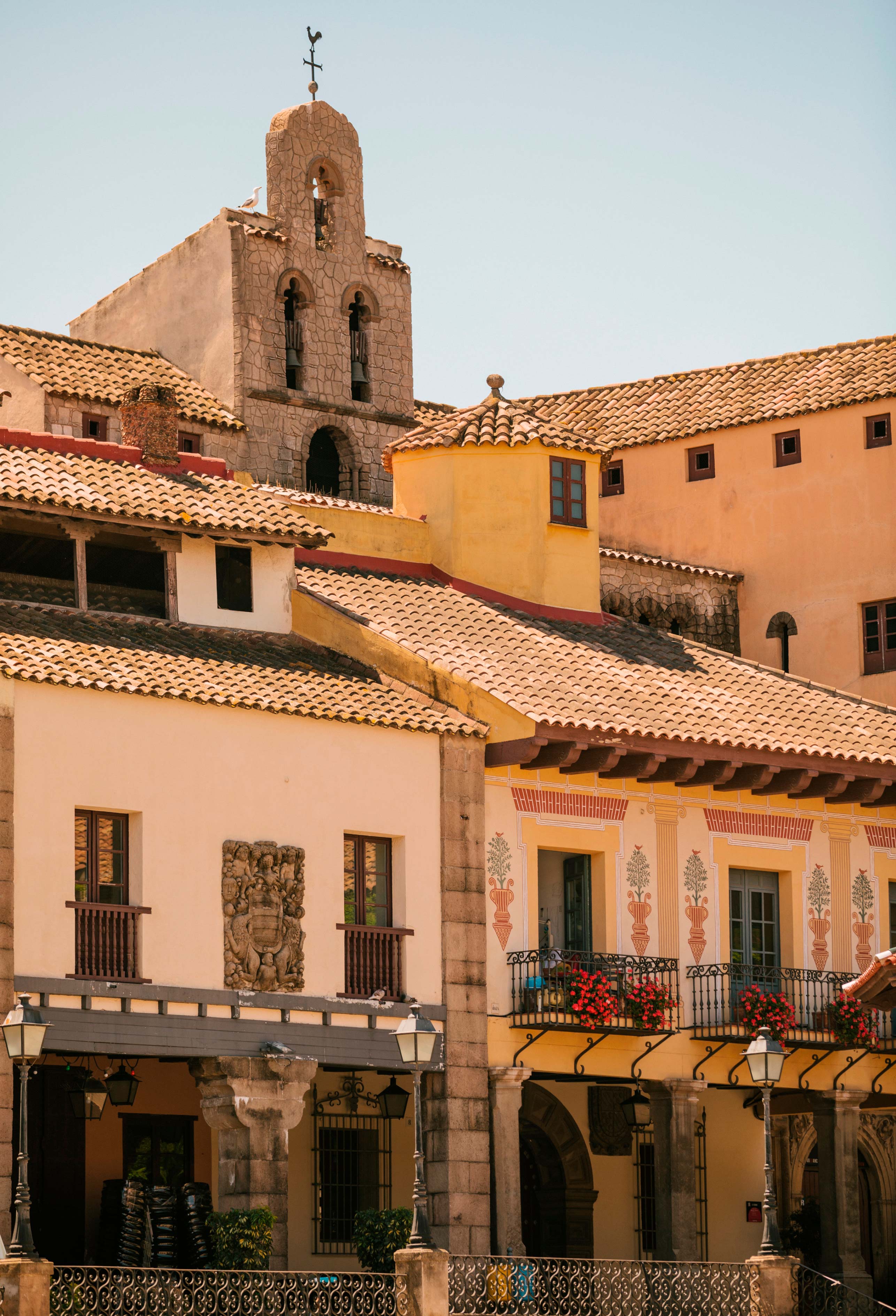
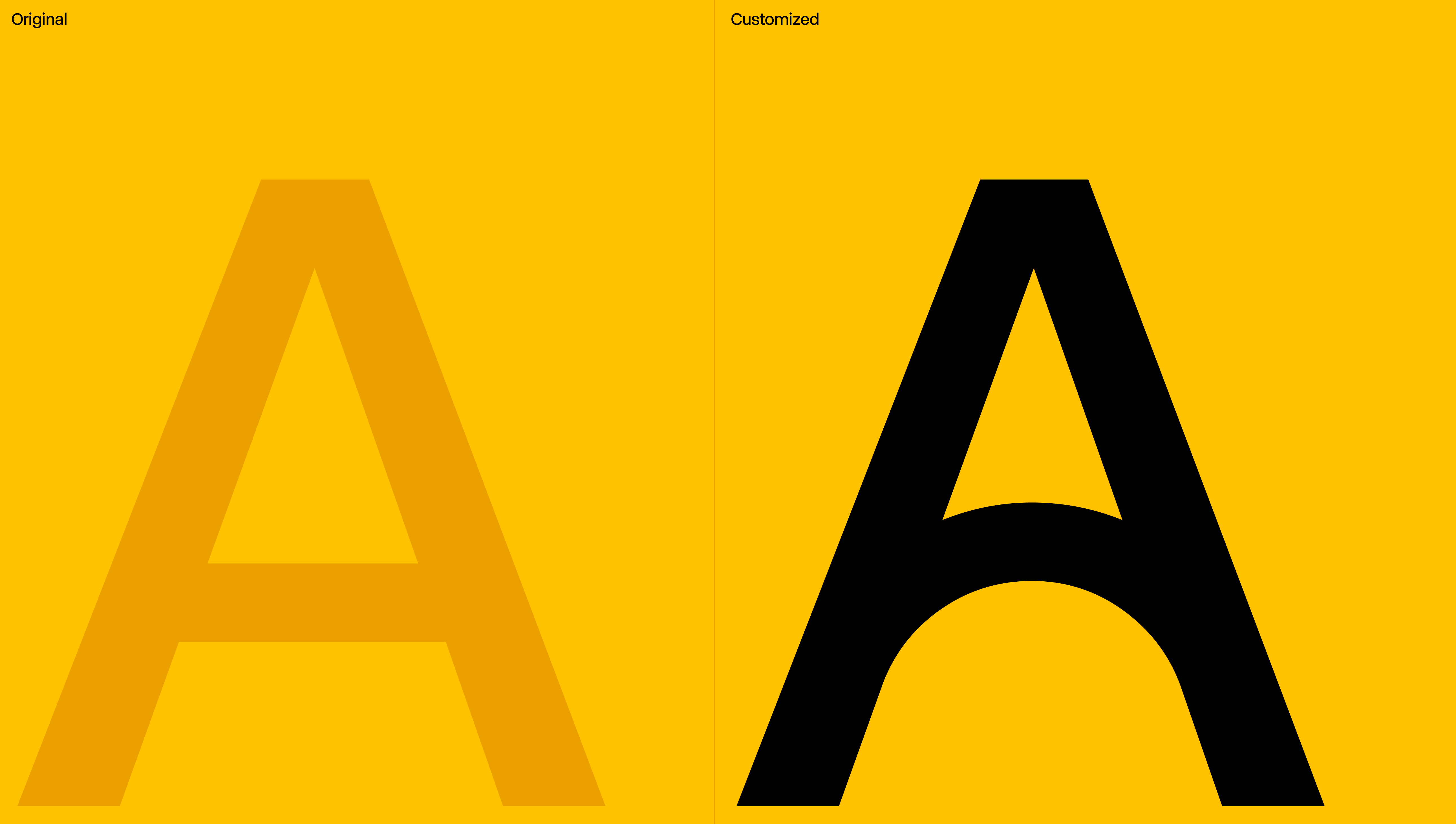
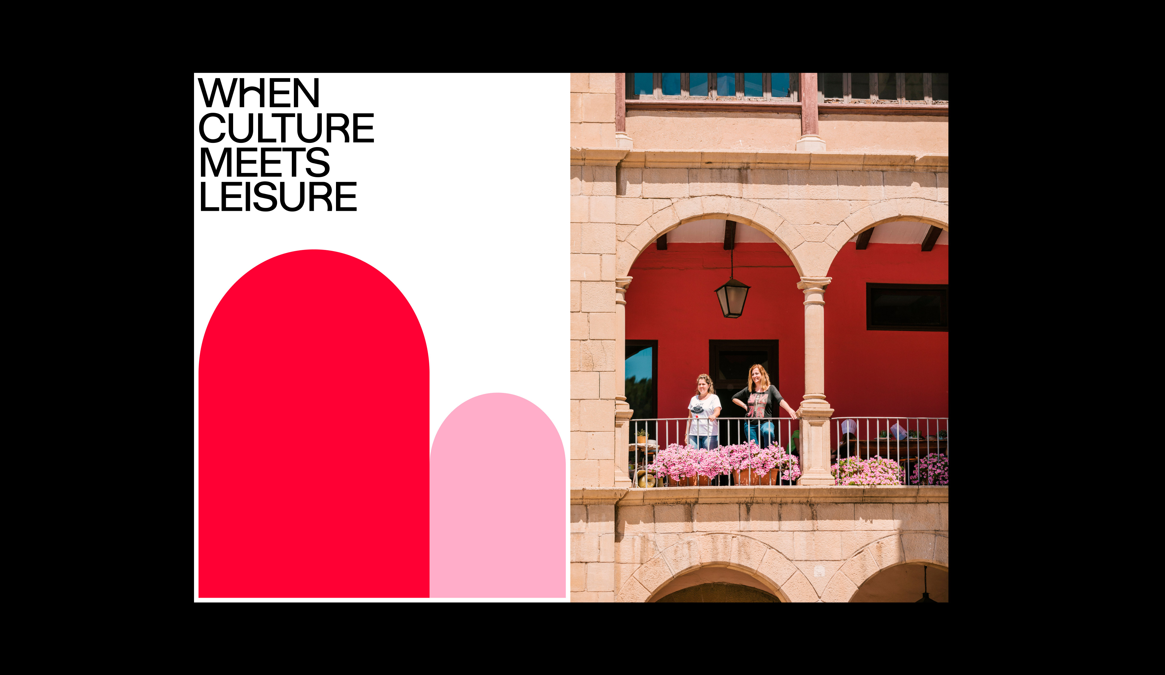
The arch, featured in the previous logo, is a key architectural element widely present in the windows, doors, or arcades of the premises. Through an abstraction of its form, we created the logo, which is a nod to the previous design, and built the visual system and typography.

Typography
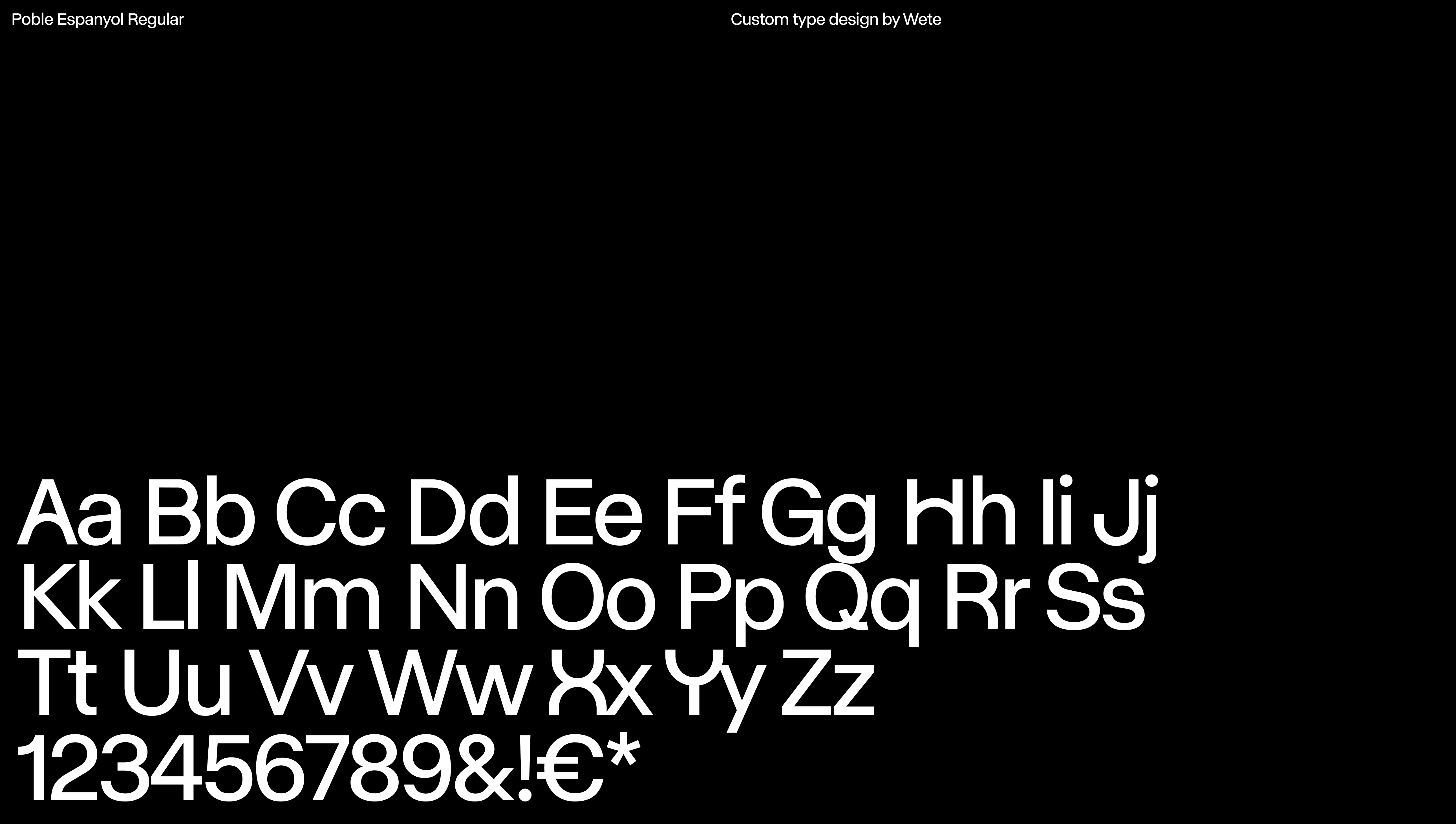
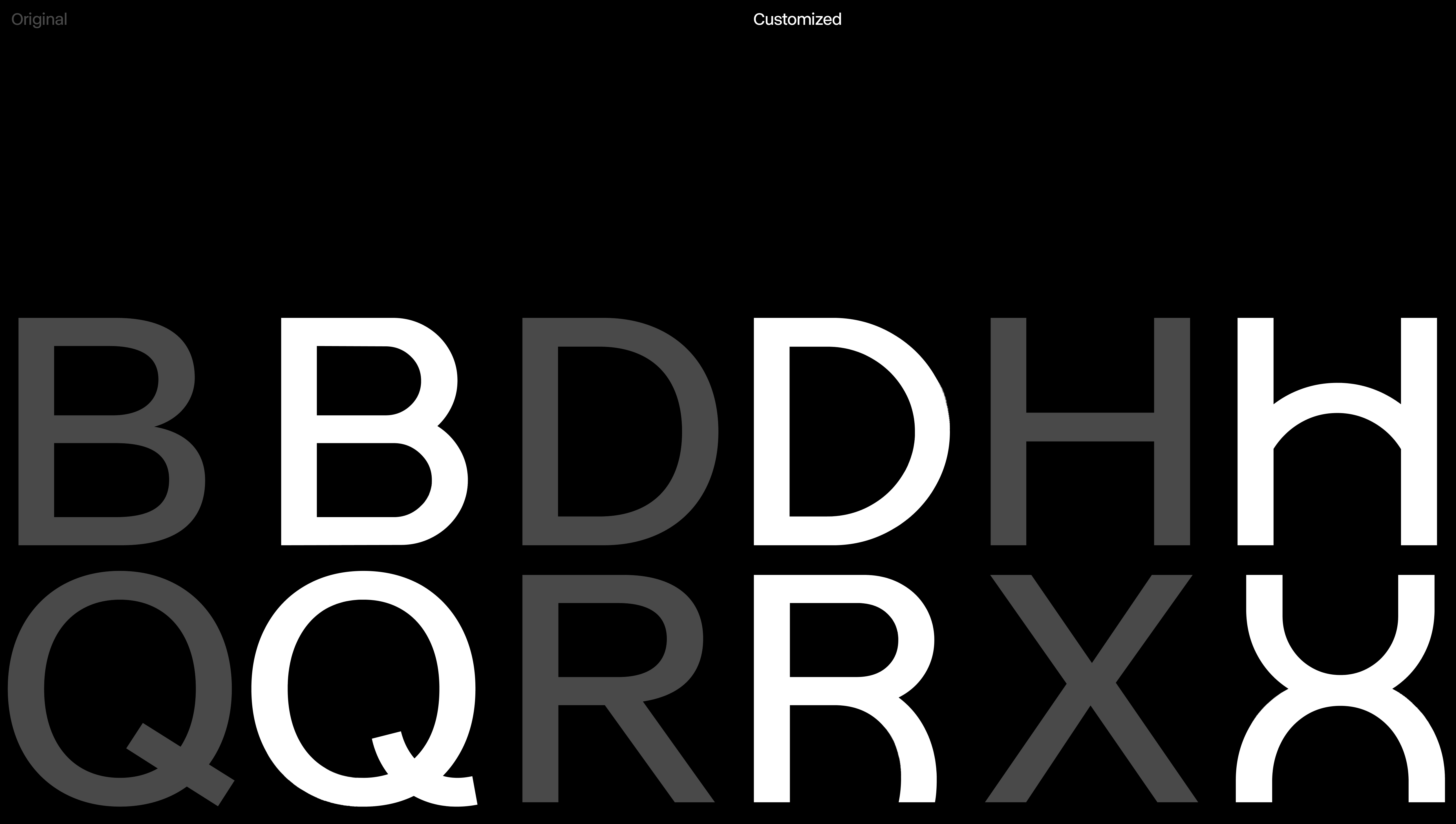
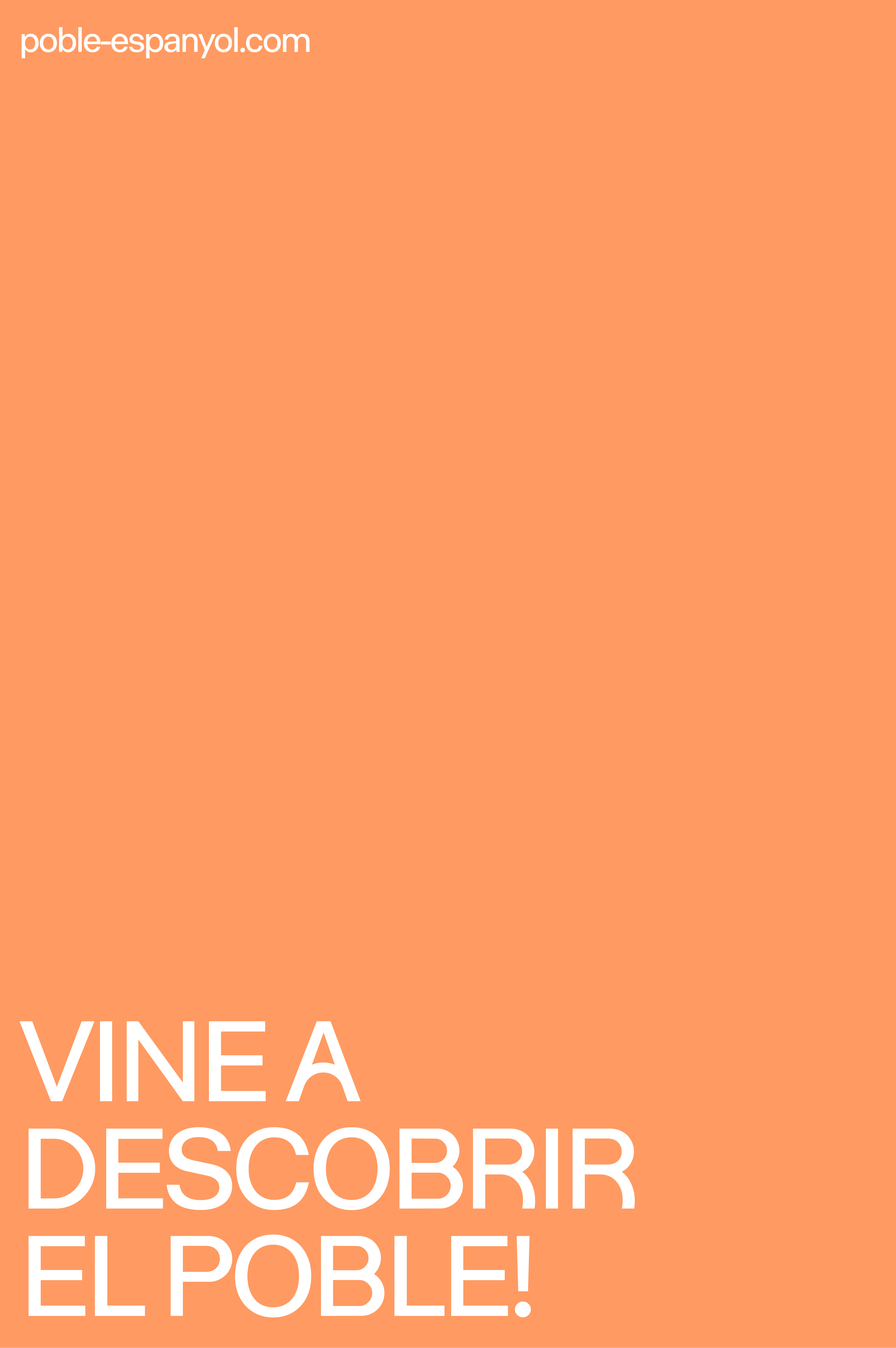
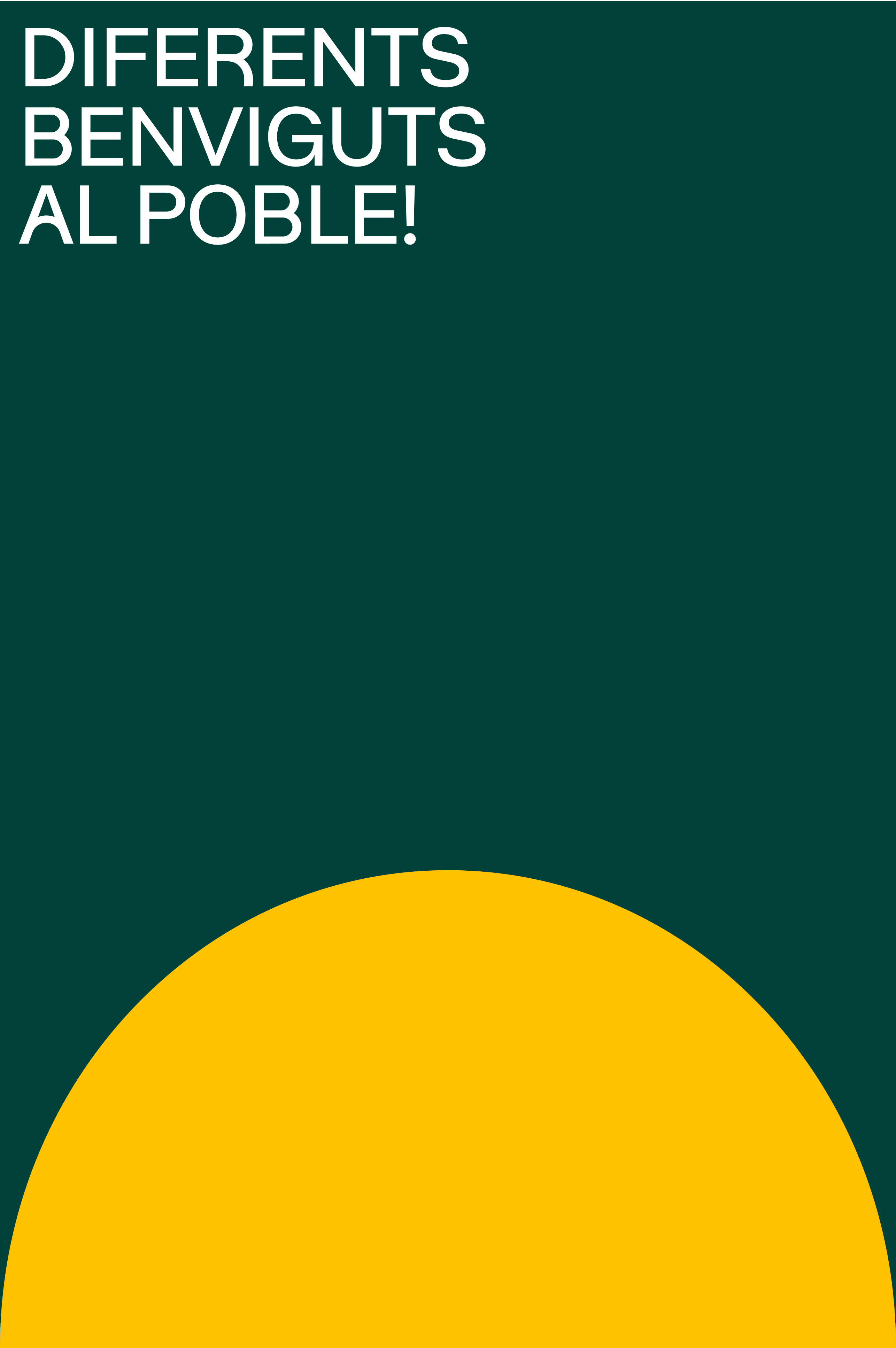
To represent the voice of Poble Espanyol, unique, special and full of contrasts, we created our own typography that evokes the versatility of the venue from shapes composed of straight and circular elements inspired by the architectural columns and arches that are part of the essence of the space.
Brand expression
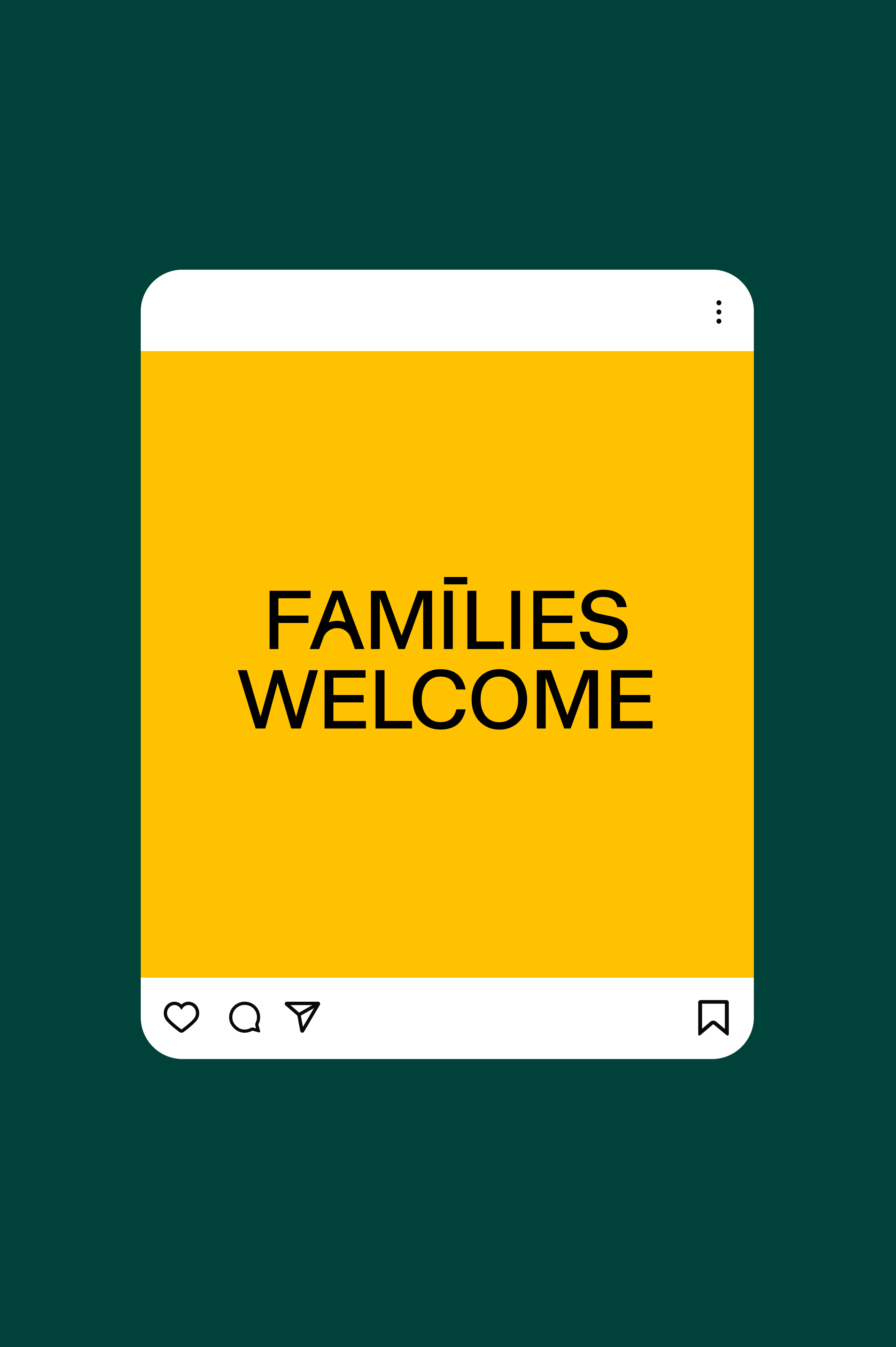
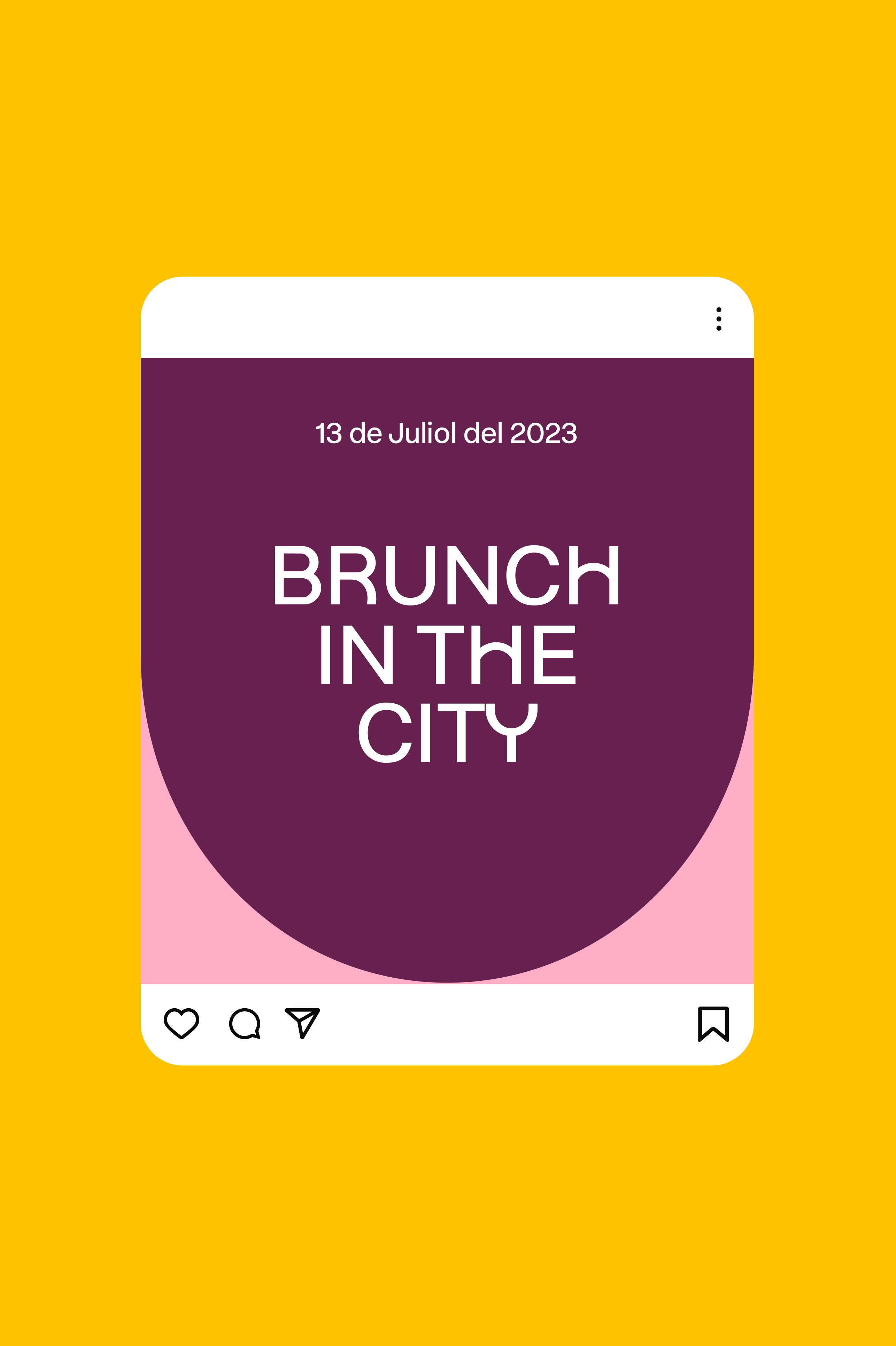
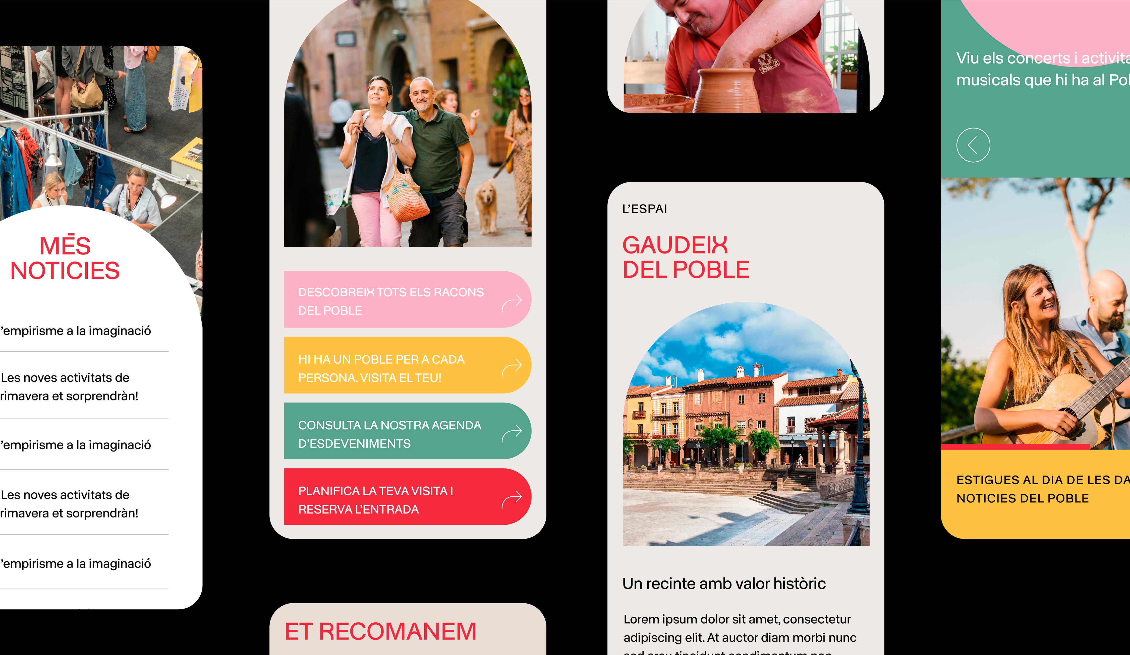
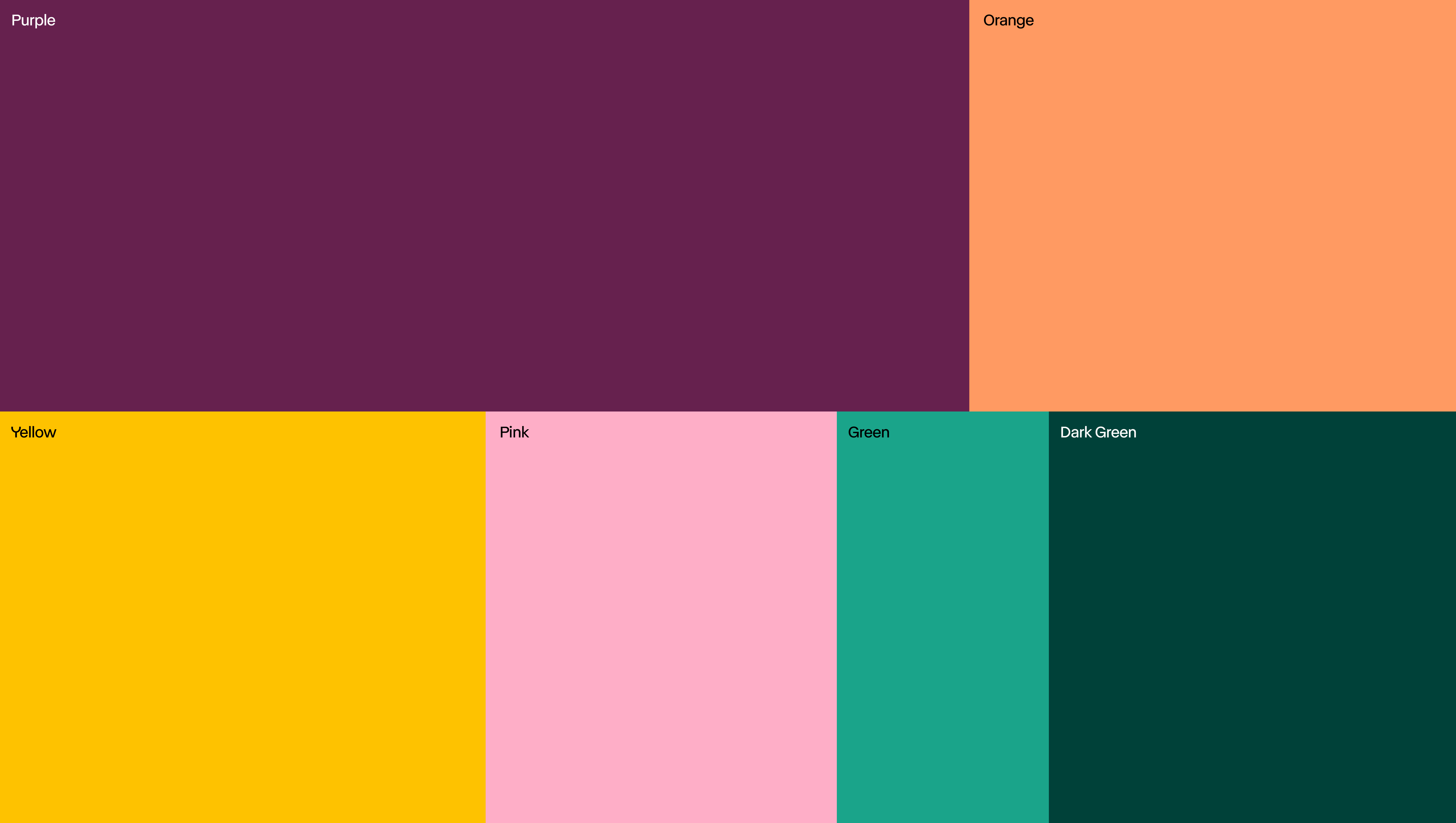
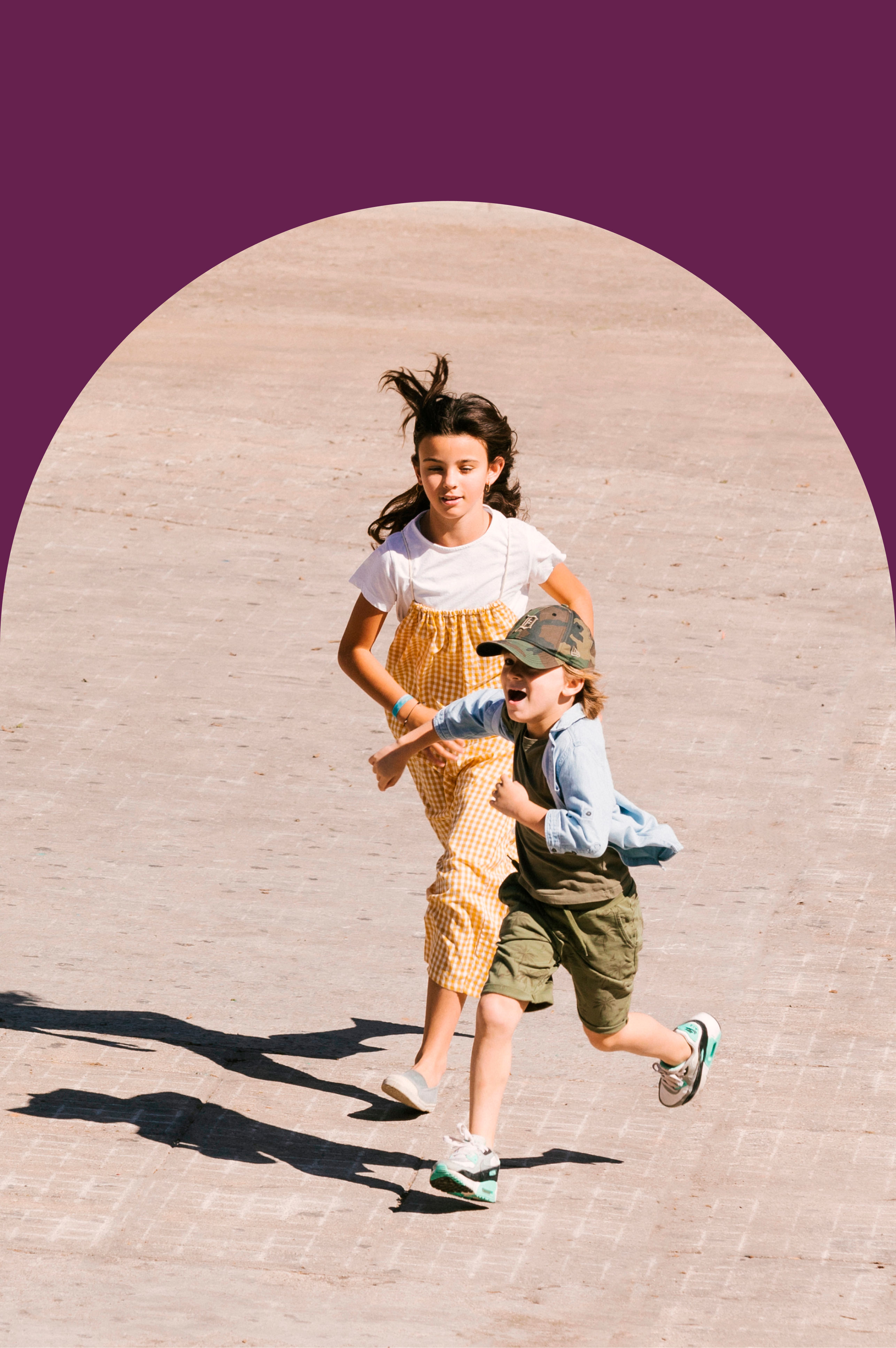
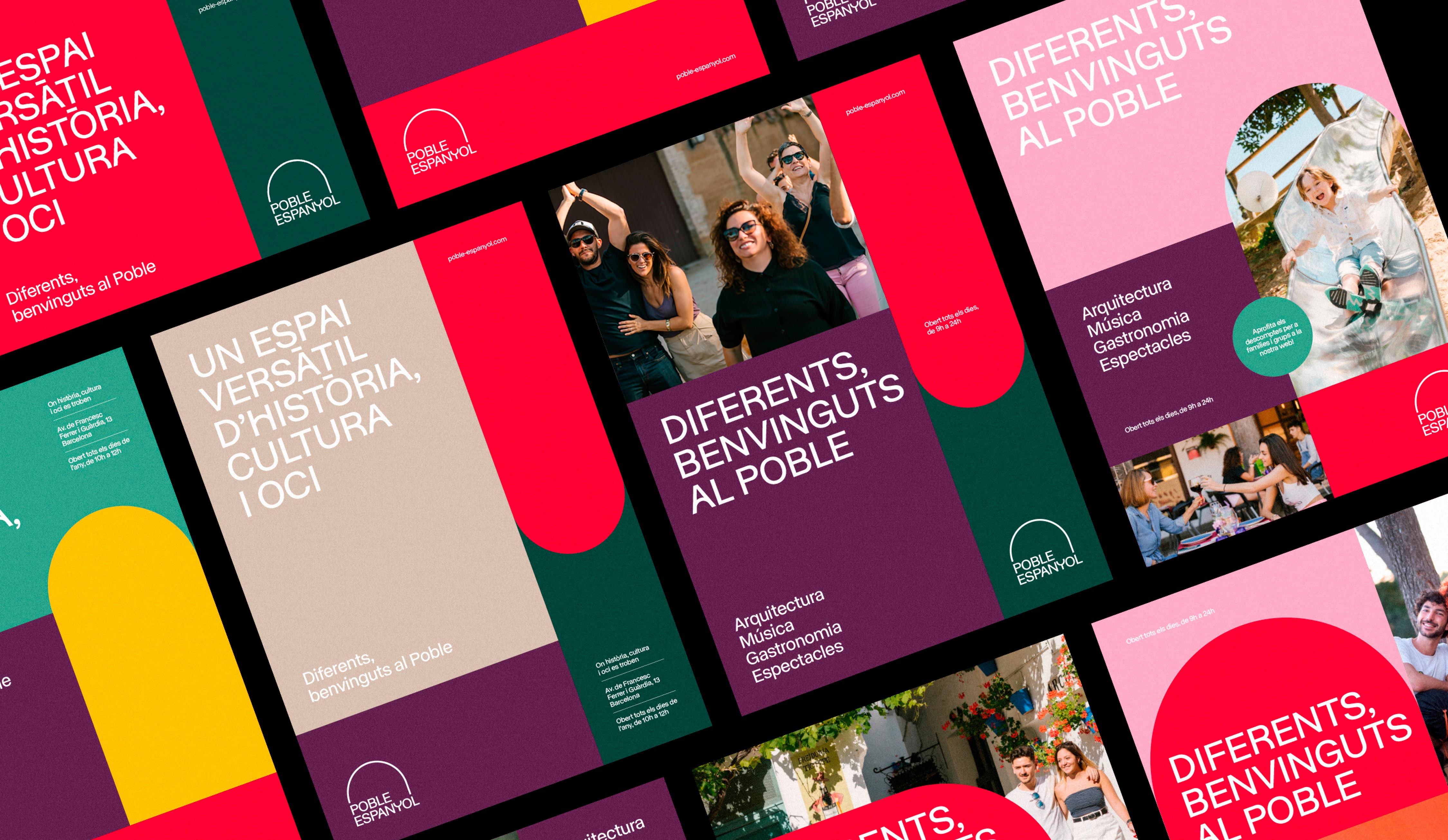
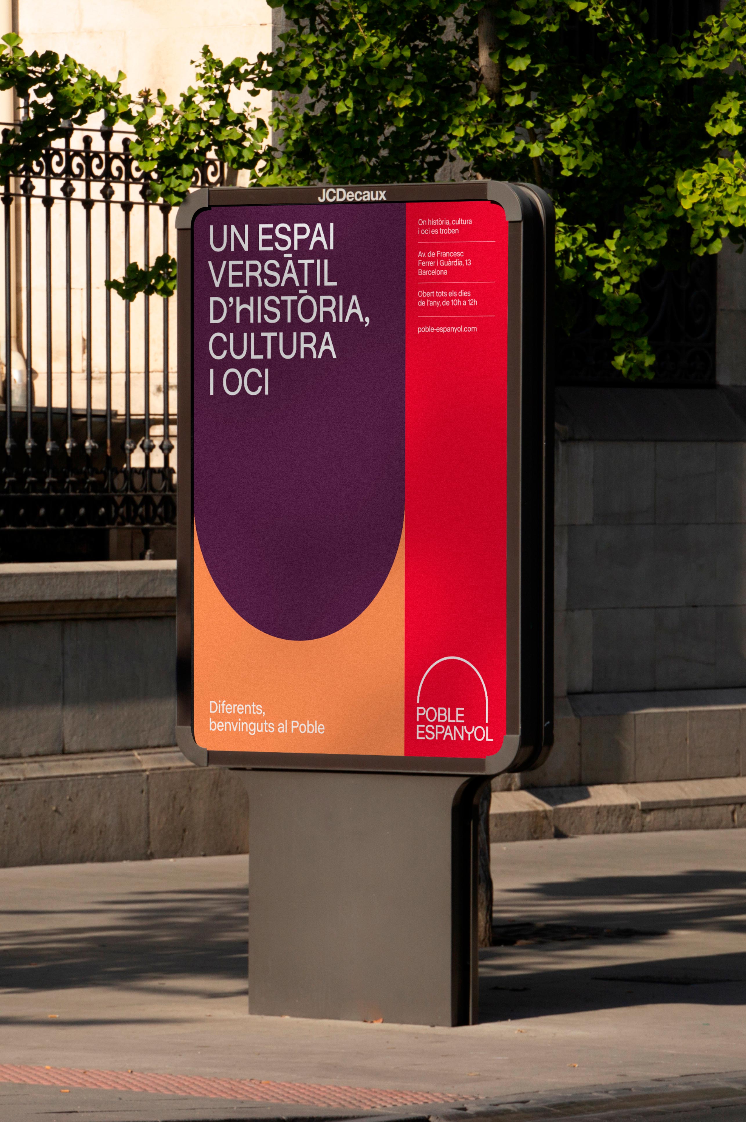
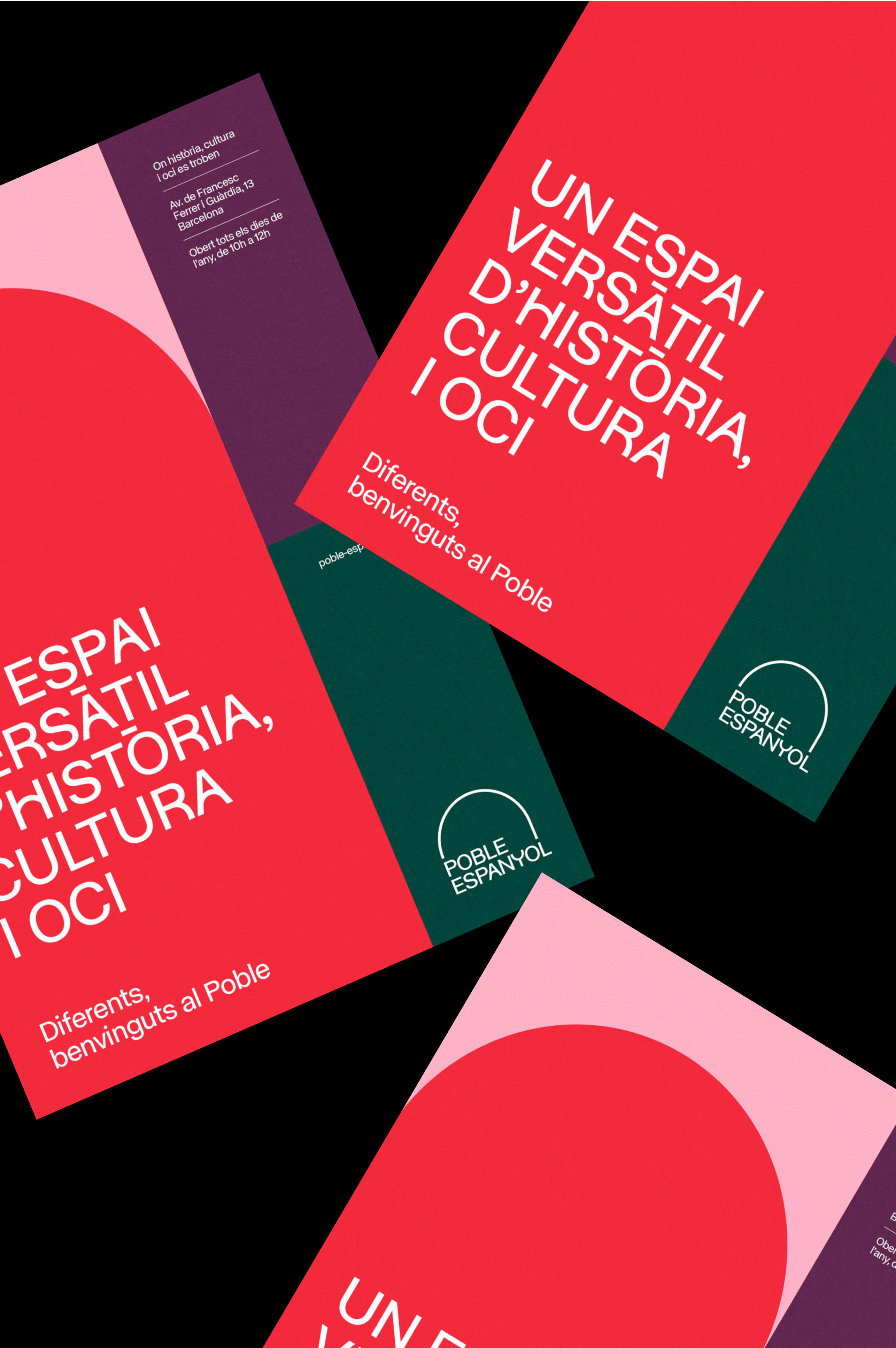
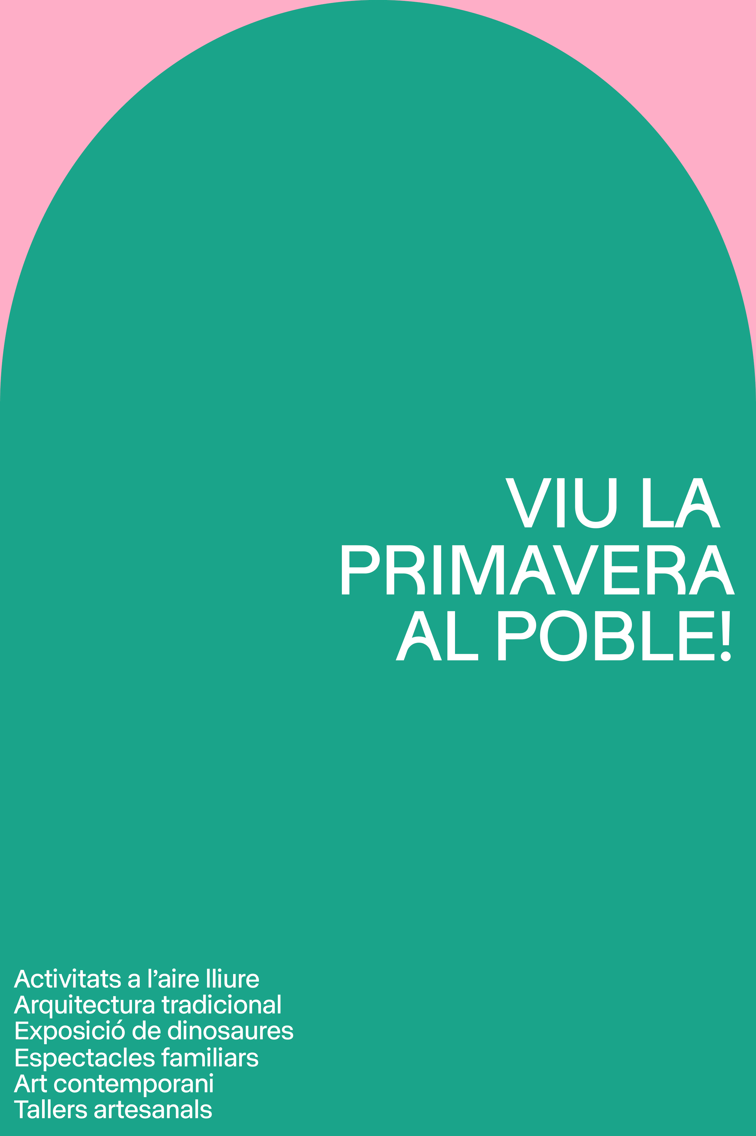
The architectural element of the arch also helped us to build the graphic system, dividing the pieces into different parts and contrasting rectangular spaces and arches to freshly represent the space, its diversity and the recreational and festive component of the venue. In short, an open, plural and inclusive space. A different, authentic and unique space.
Brand implementation
Once the brand is defined, we created the different applications and necessary contact points for its official launch.