








Qida
A new look & feel with touches of humanity for a premium, expert and personalized home care service
Background
At Qida they are aware that the best place for a dependent person to be is at their own home. But organizing proper care is complicated, as it requires effort and dedication. They had plenty of this. But their brand and its communication wasn’t communicating its value proposition clearly enough, a proposal focused on improving people’s lives by helping them stay at home for longer.


Brand expression
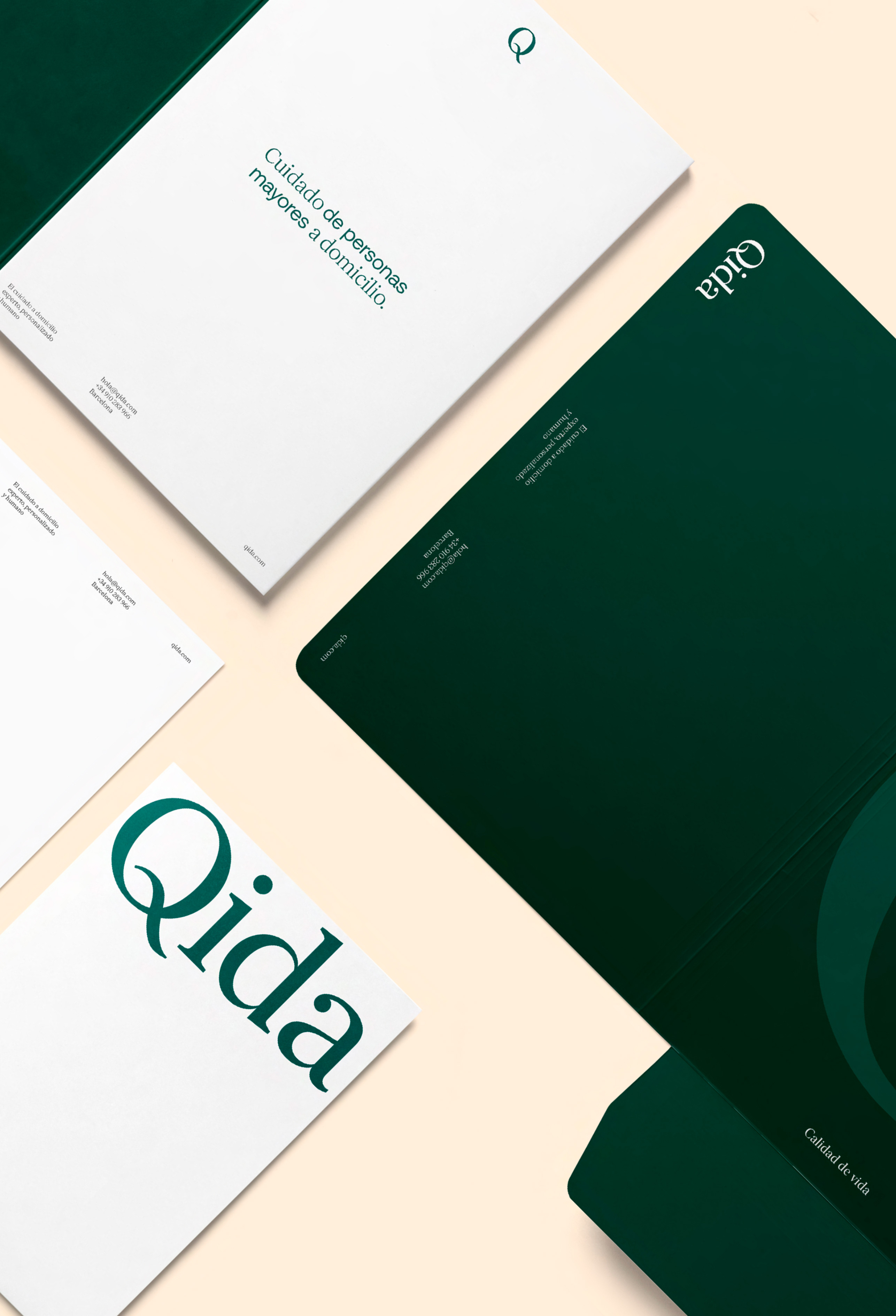
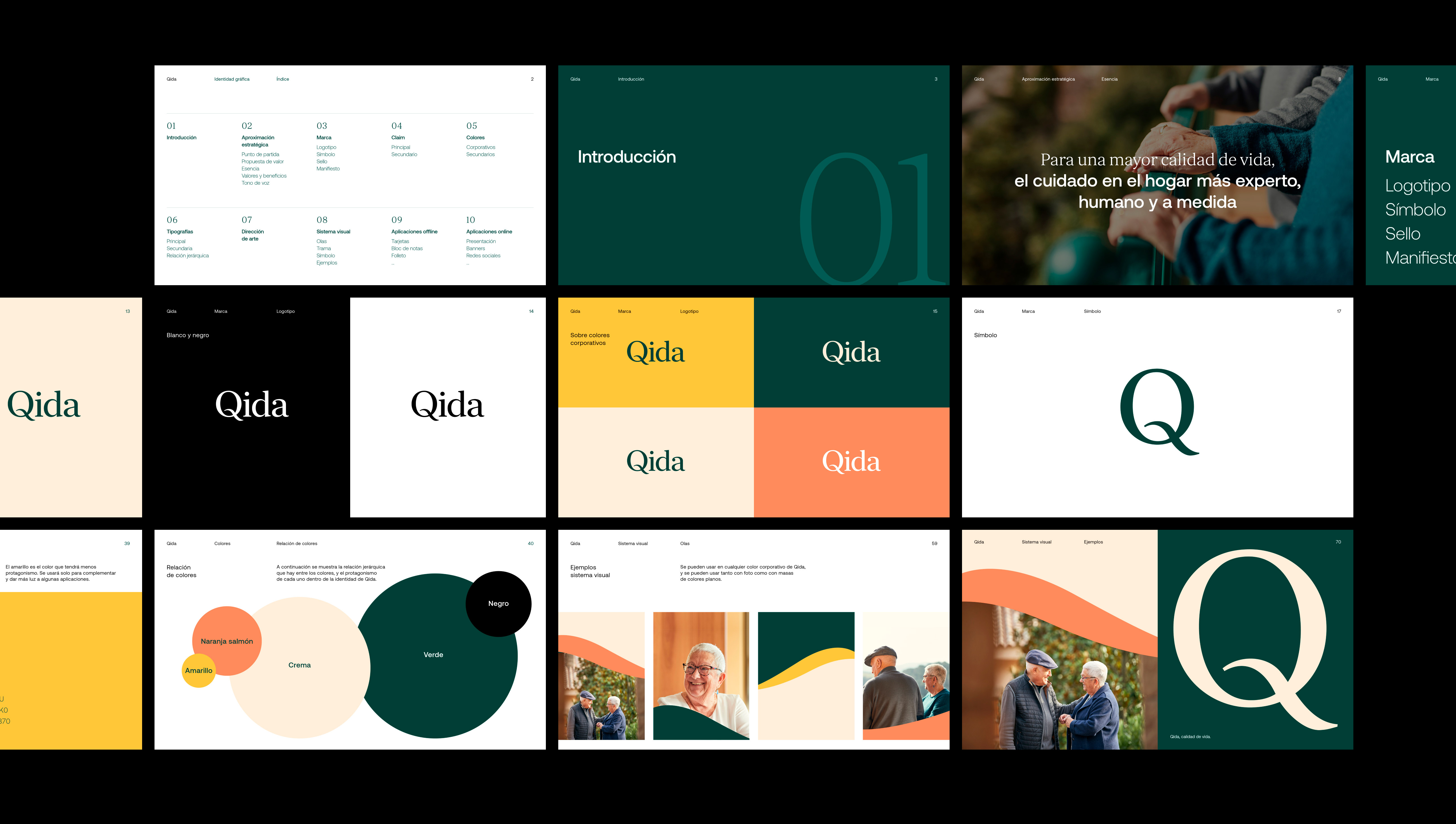
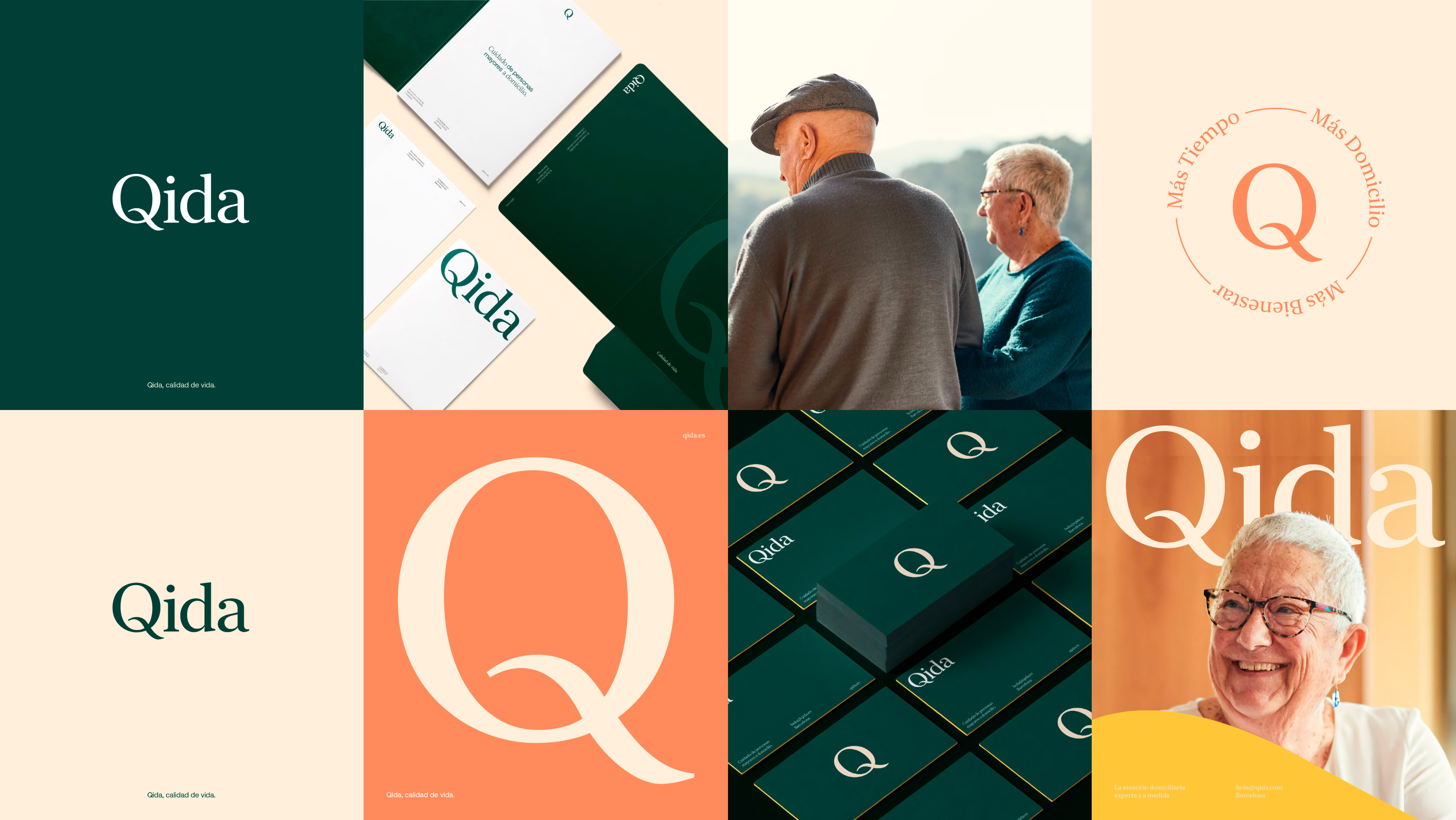
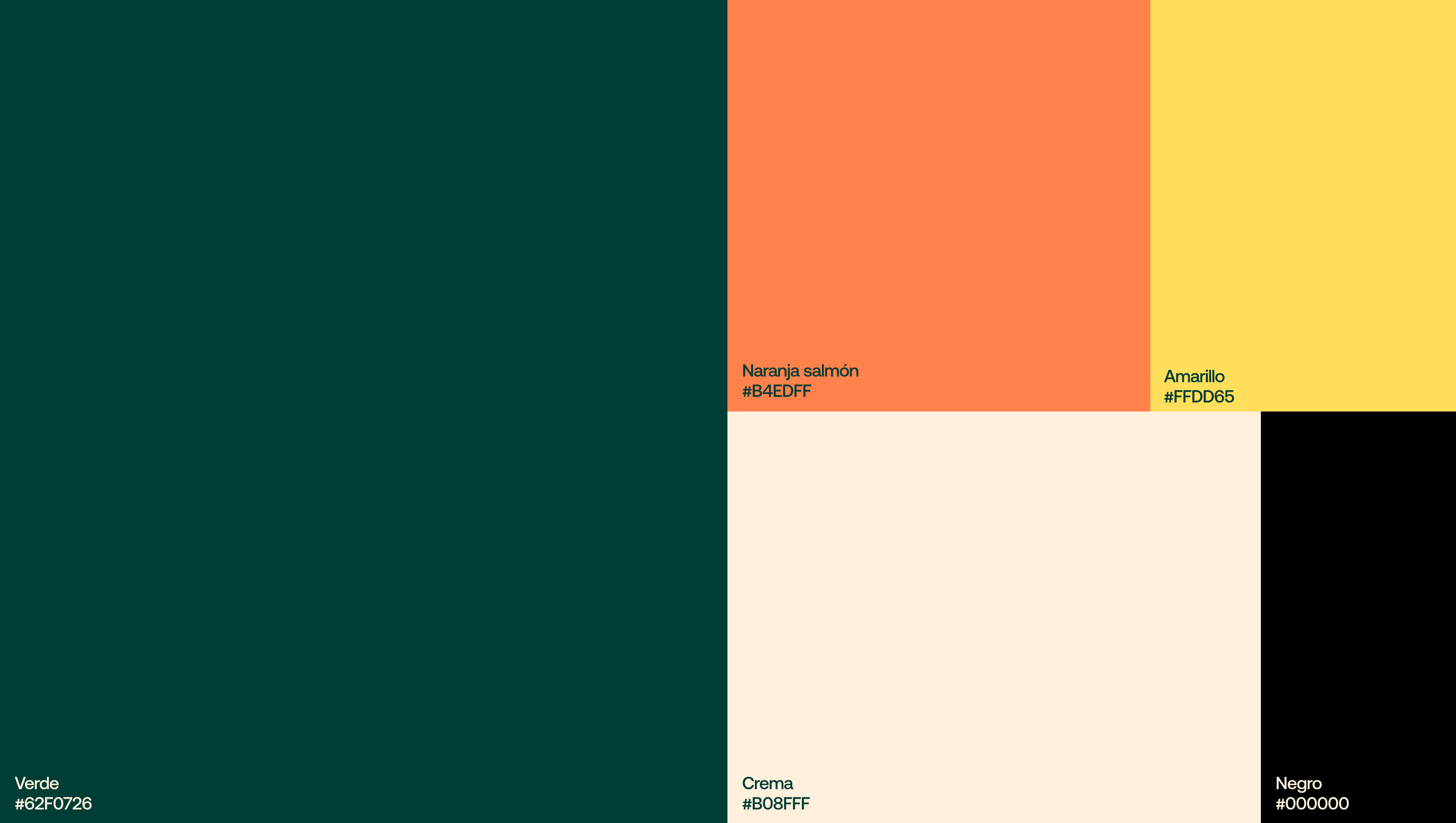
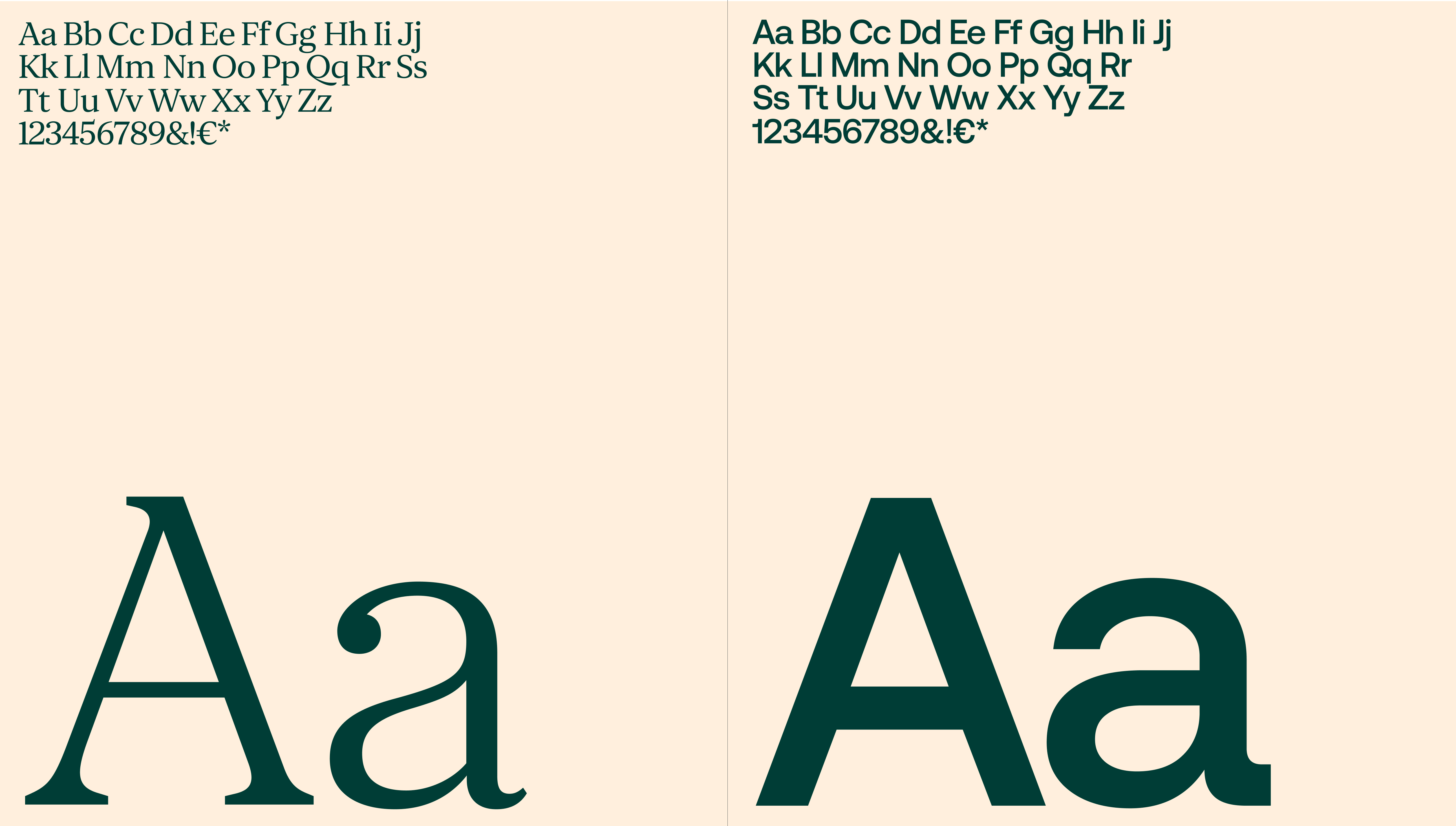
One of the main objectives of the project was to create a new brand expression that would give coherence to the different touch points and allow the brand to be more recognizable in all of them, generating greater impact.
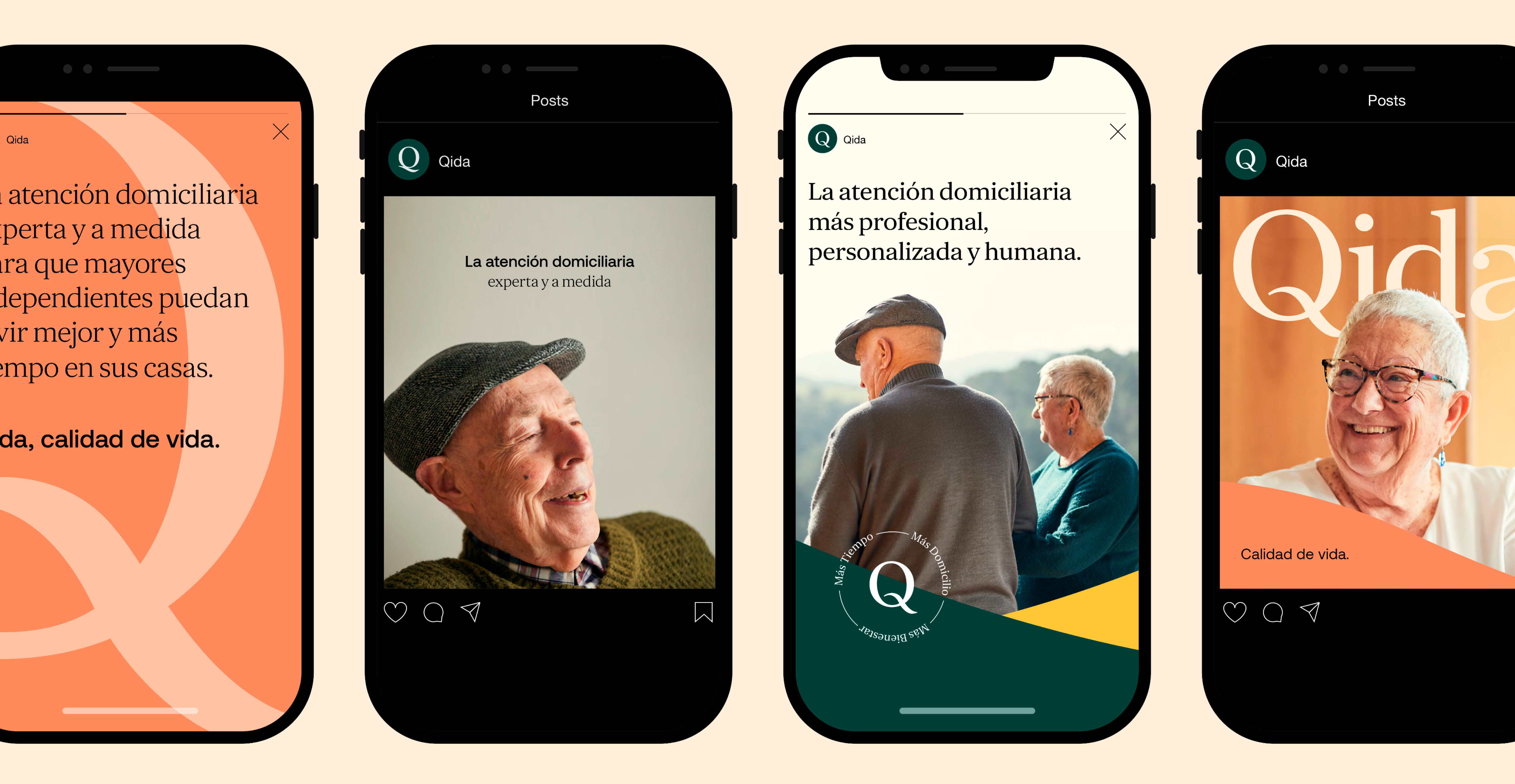
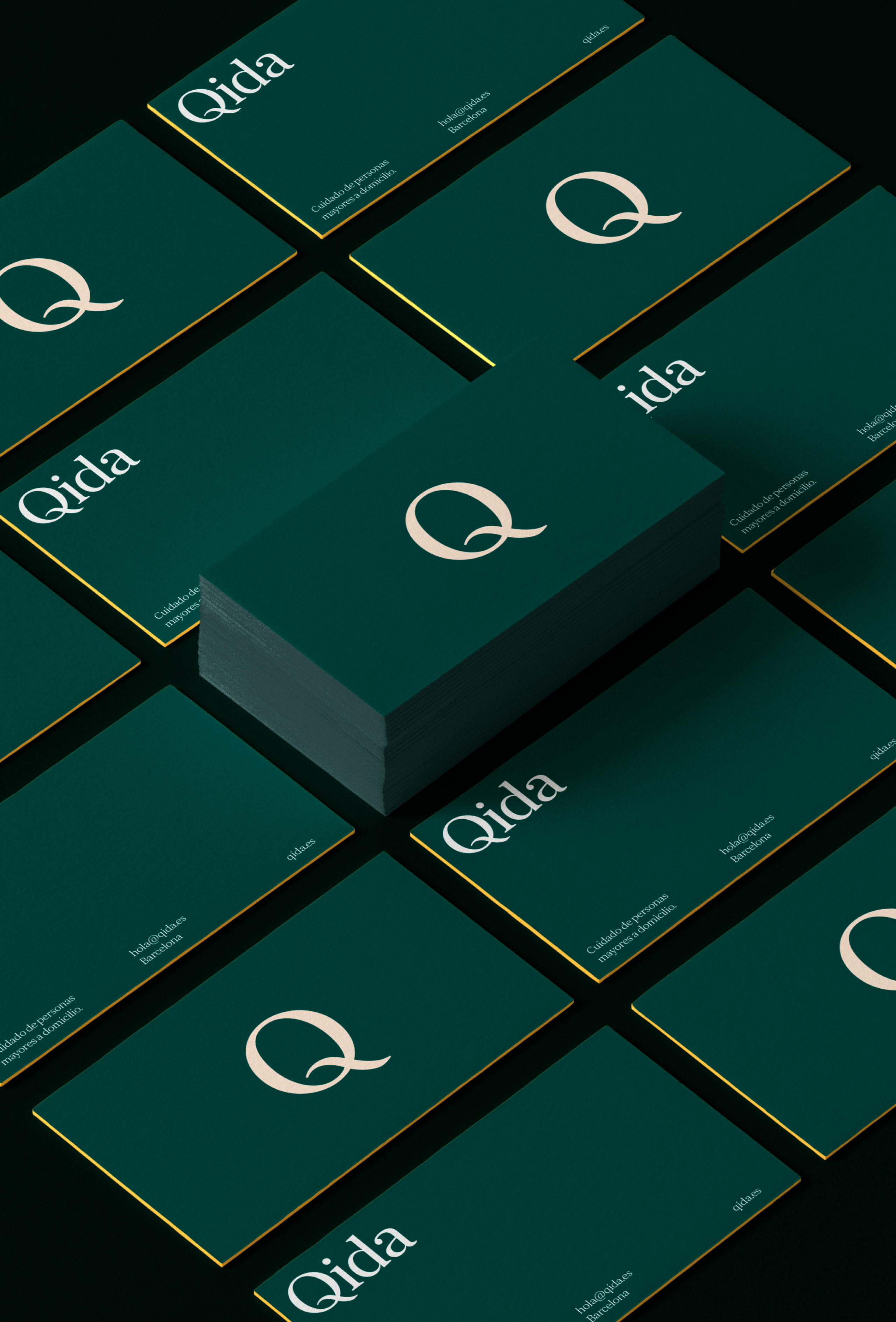
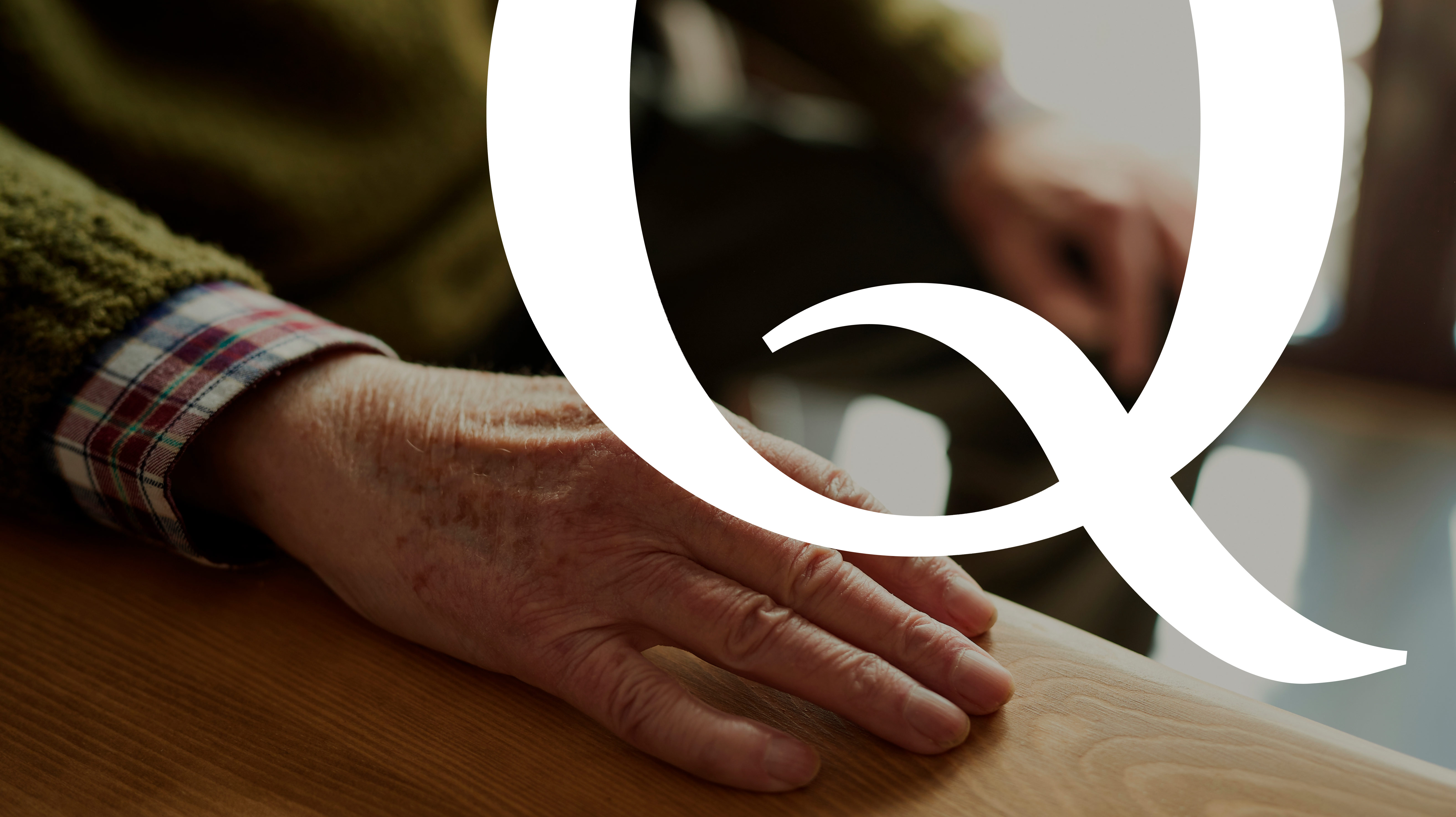
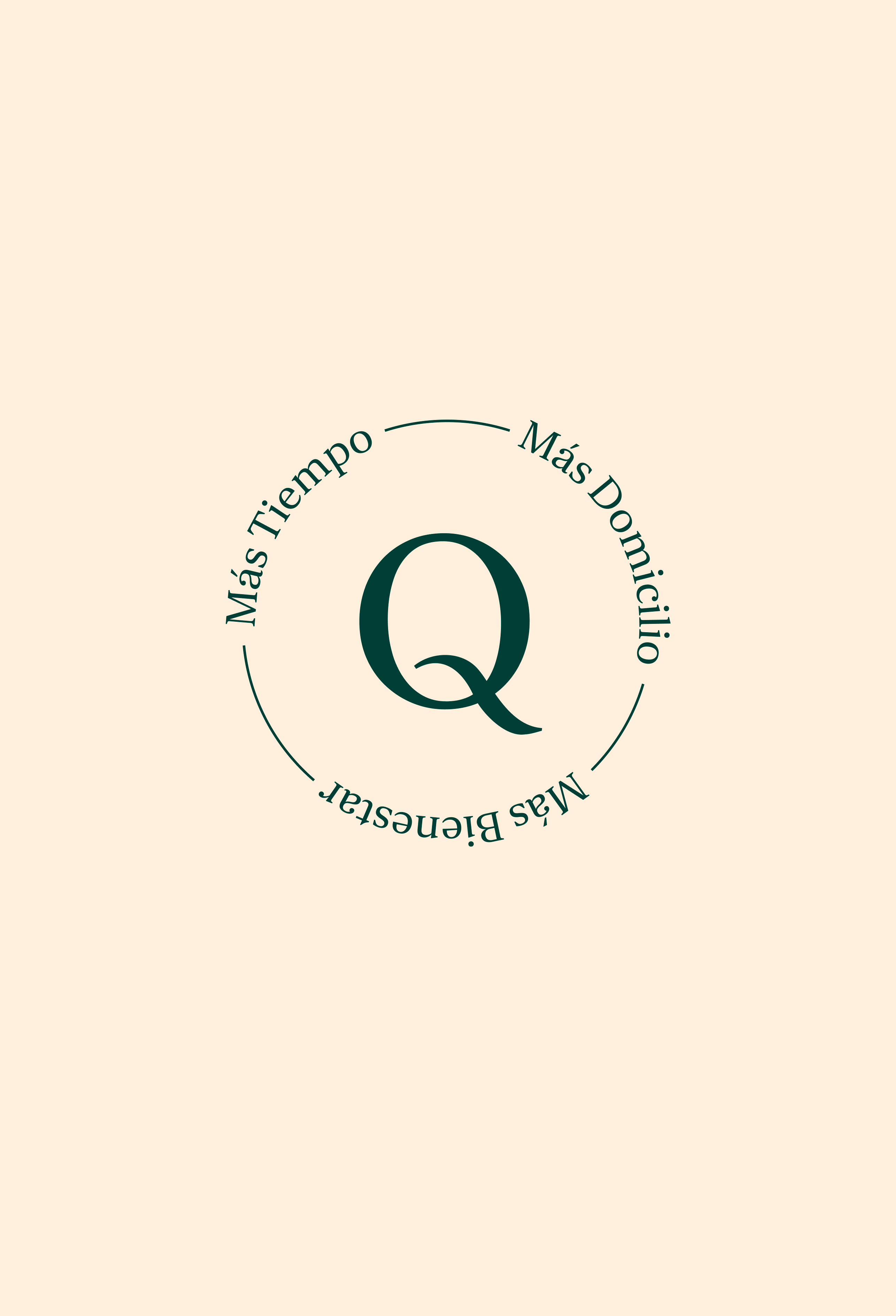
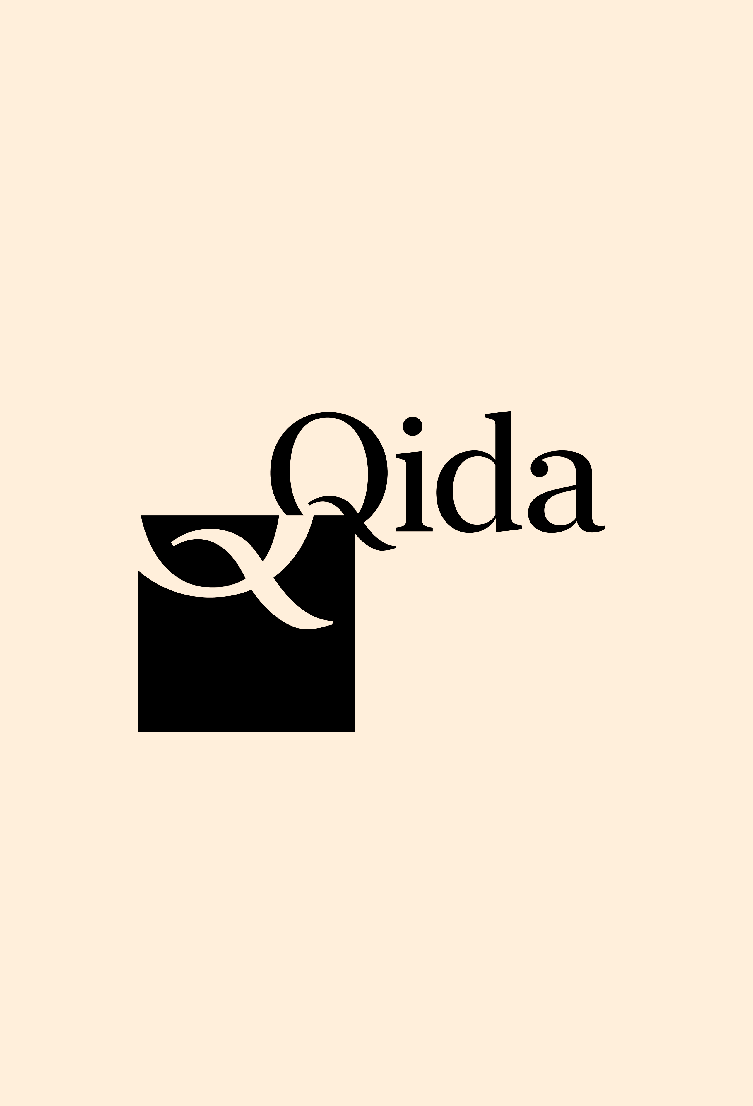
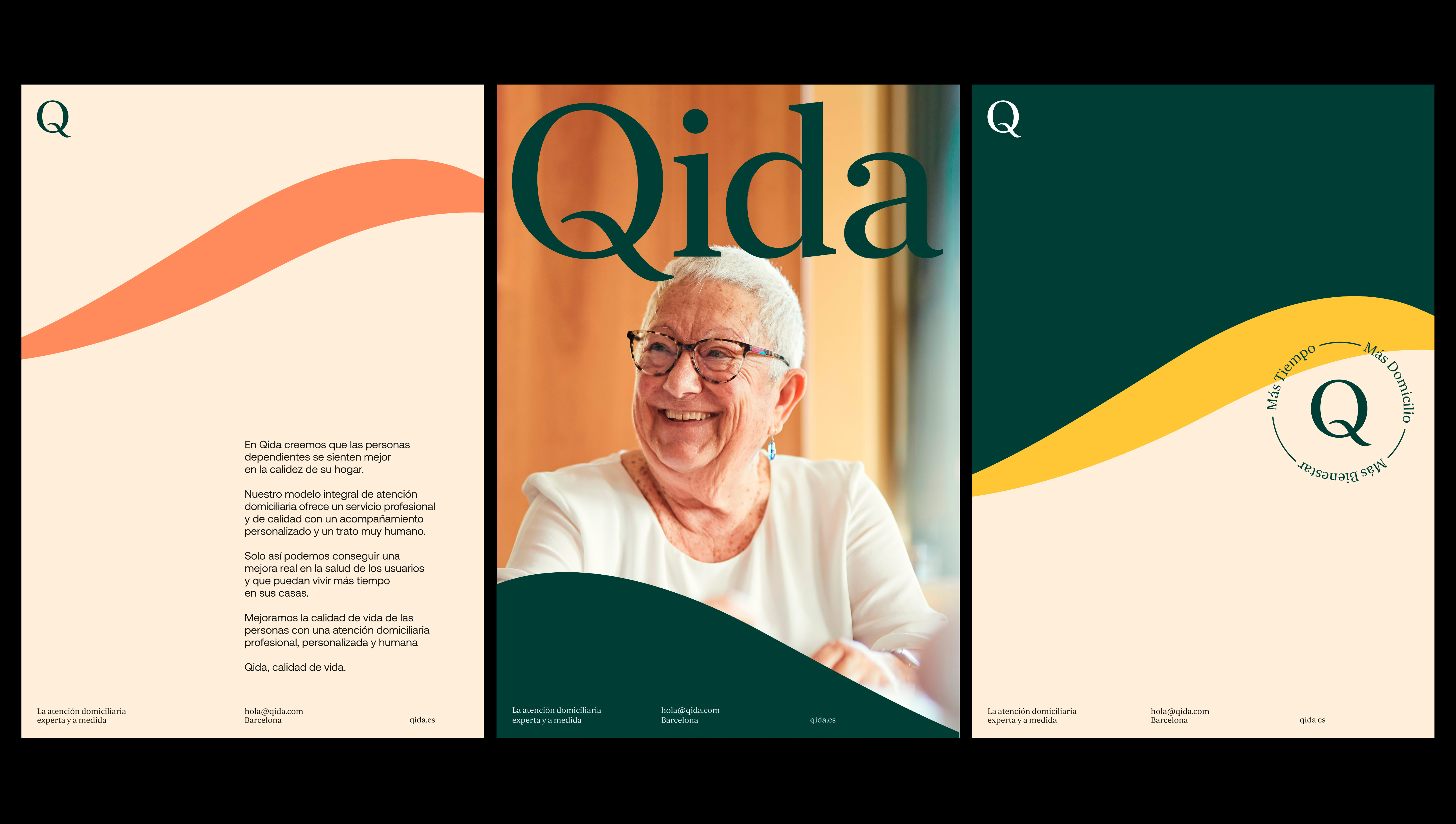
We did this by using the Q as a symbol, giving it a predominant role and even creating a stamp to emphasize Qida benefits. The curved lines of the Q brought us to create the wave shape that evokes calm and care and is used throughout the graphic system.


Brand implementation
The new brand expression enabled us to construct a more human universe without sacrificing seriousness and elegance associated with a premium service with a high degree of specialization